What's new

Airliners: how is my composition?

thevideographer

TPF Noob!
Joined
Aug 28, 2011
Messages
36
Reaction score
6
Location
Grand Forks, North Dakota
Can others edit my Photos
Photos OK to edit
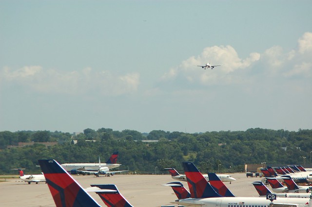
Hi everybody, I'm looking for feedback on a couple pictures I took at the airport. I thought they were okay but not perfect. I posted them on another site and basically got destroyed for having crappy composition but I'm not seeing why. So are they all crazy or is it me? Have a look:
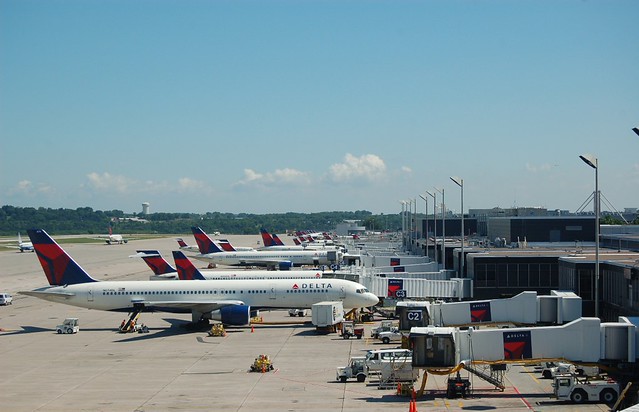
6100162225_3f1889acda_z.jpg


6100162443_e0f5d4ceaf_z.jpg


They were both shot through a window, which is why the colors look a little off.
 
Did you ask on the other forum what about the composition is crappy?
 
First one ... too much sky. I would suggest cropping it out and making a panorama.
I you moved more to the right you could have lined up the ramps and had the planes in a diagonal.

Second one ... the planes are the tarmac are cut off too much.
Too much empty space in the sky.
You should have shot vertical and also waited for the incoming plane to be larger in the shot.
 
Both are really busy to me - there's nothing that grabs your eye and brings you into the shot. In the first one - the suggestion to move to put the planes at a better angle is a good one. The second suggestion about having the incoming plane be larger is also good, though different framing would have improved it a lot too.

These pictures look like something anyone could take from the window while waiting for their plane. There's nothing in their composition, etc., that is compelling to make you look at them. The busy-ness of the images and clutter make them less inviting - does that make sense? At least, that is what I see in the images.
 
Both are really busy to me - there's nothing that grabs your eye and brings you into the shot.

This ^^^.
From time to time we get some nice airline photos posted here. The really nice ones are mostly just airliner. No jetways, no carts on the tarmac, no other planes. These are basically snapshots from the gate window. There's no real subject in either of them, and as a result, the eye just wanders around the picture. A clearly defined subject gives the eye a place to go and a place to focus on.

In the second shot, I'm guessing the incoming plane is the intended subject. It's too small, by far, and almost gets lost in the clouds behind it. The brightly colored tails in the foreground command much more attention than anything else in the pic. The eye is naturally drawn to brightness and color, so my eyes immediately get pulled down to the bottom of the frame. So, to answer your question, no, they're not all crazy, it's you. Do some reading on composition. There's a lot of free material on the internet, as well as many books on the subject.
 

Create an account or login to comment

You must be a member in order to leave a comment

Create account

Create an account on our community. It's easy!

Log in

Already have an account? Log in here.

New Topics

Back
Top Bottom