Navigation
Install the app
How to install the app on iOS
Follow along with the video below to see how to install our site as a web app on your home screen.

Note: This feature currently requires accessing the site using the built-in Safari browser.
More options
You are using an out of date browser. It may not display this or other websites correctly.
You should upgrade or use an alternative browser.
You should upgrade or use an alternative browser.
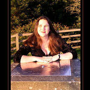
Alexis- Model Portrait
- Thread starter DanOstergren
- Start date
- Joined
- Jun 2, 2013
- Messages
- 4,493
- Reaction score
- 4,141
I was letting my intern borrow the 135mm.Any reason you went 85 vs 135?
- Joined
- Jun 2, 2013
- Messages
- 4,493
- Reaction score
- 4,141
Thank you.Nice, good use of a leading line, good lighting and I like the tones which are all very complimentary which your PP has matched really well. A very good fluid coherant portrait IMO.
Just a happy accident. Thank you.I really like this.
The thing I like most about it is that the highlights in her hair mirror the curling rushes behind. Don't know if you intended that at the time, but i'll assume you did
The background and processing are really well suited to her look, too. Really nice portrait.
Thank you.Gorgeous!
Thank you. That's what I try for.Very nice! Especially the pond in the background.
Your photos definitely tell a story, so much emotion and 'feel' to them.
Thank you. In all honesty the color tones needed very very little changing. I just barely enhanced what was already captured by the camera. The sun had just barely gone down and the sky was partially overcast, and to me that lended to the natural color cast already created by the surroundings and the wardrobe/ model.Not sure if anyone's gunna follow me here or not but there is a really nice "swirling" effect that this composition has on my eye. As in, when I look at it my eye follows the log up and around the model and I explore the background while never really taking my focus off of her; so I get a sense of the environment while never even moving my eye away from her at all.
Very nice shot. I'm especially loving the subdued colors in this.
Lol, in all honesty this image is pretty close to being straight out of camera besides some skin touch ups and dodging and burning. To each there own though; clearly not everyone is going to like my style, and I'm learning that those who don't just LOVE to say so.Nice light and a very nice portrait. I'm not a fan of the processing however. It's very faddish and I don't think it was ever a productive fad. Removing all black from the photo (matte black look) just makes it look like a botched exposure -- IMO. And blue/cyan skin is not flattering for the young lady or people in general. Again it's very faddish but I find it unattractive to see her looking oxygen starved -- IMO.
Joe
She's wearing black lipstick and her sweater has skulls and crossbones on it...
I saw that -- and if she was wearing makeup to add a blue/cyan color cast to her skin -- if the presentation was more theatrical......ok. The back of her left hand is prominent in the photo. That is not the skin color of a healthy human being and I find that disconcerting even given the skulls on the sweater and the lipstick -- IMO.
Joe
I think if that hand were dodged a bit it would look fine, but to each their own. If it didn't have the grading that it does, I wouldn't like it as much.
I guess I prefer disconcerting over dissonant.
photoguy99
No longer a newbie, moving up!
- Joined
- Mar 20, 2014
- Messages
- 1,485
- Reaction score
- 313
Well, it's a photo of a pretty girl.
- What an obviously urban girl like her is doing in a bunch of dried weeds next to a lake is anyone's guess.
- The bokeh are jittery/nervous, which makes the already chaotic and uncomfortable background moreso.
- As usual, you've pushed the contrast up to make her look kind of strobed, but you're not given the weeds the same treatment, so the light on her makes no sense in context.
- She's got her "this is the face I use when someone's photographing me" face going on, and so is completely closed to us. This, there exists, to my eye, the exact opposite of an emotional connection here.
- Corpselike skin, as noted. But you're in Portland, right? Where corpselike skin is in fact the norm in spring.
That's what I see. These all might be good or bad things depending on what you want out of the image.
- Joined
- Jun 2, 2013
- Messages
- 4,493
- Reaction score
- 4,141
Sarcasm and nitpicks aside, thanks for sharing your opinions.Well, it's a photo of a pretty girl.
- What an obviously urban girl like her is doing in a bunch of dried weeds next to a lake is anyone's guess.
- The bokeh are jittery/nervous, which makes the already chaotic and uncomfortable background moreso.
- As usual, you've pushed the contrast up to make her look kind of strobed, but you're not given the weeds the same treatment, so the light on her makes no sense in context.
- She's got her "this is the face I use when someone's photographing me" face going on, and so is completely closed to us. This, there exists, to my eye, the exact opposite of an emotional connection here.
- Corpselike skin, as noted. But you're in Portland, right? Where corpselike skin is in fact the norm in spring.
That's what I see. These all might be good or bad things depending on what you want out of the image.


Have a lovely day! I know I sure will!
Last edited:
- Joined
- Jun 2, 2013
- Messages
- 4,493
- Reaction score
- 4,141
Wow, thank you! I work very hard to constantly improve in that aspect, but also work equally hard to make sure the exposure is as close to perfect as possible straight out of camera as well.I think what sets you apart from so many is your post-processing. It's killer. Truly.
Lovely image as always, Dan.
Jake
e.rose
Been spending a lot of time on here!
- Joined
- Jan 27, 2011
- Messages
- 4,789
- Reaction score
- 1,985
- Location
- Nashville, Tn
- Website
- www.emilymcgonigle.com
- Can others edit my Photos
- Photos NOT OK to edit
as a rule, so should a good photo.
There is literally no rule that says this.
It's a stylistic choice.
You don't like it, that's fine. Others do. But there is no "rule".

Fred Berg
Been spending a lot of time on here!
- Joined
- May 17, 2011
- Messages
- 1,802
- Reaction score
- 748
- Can others edit my Photos
- Photos NOT OK to edit
I would prefer the blacks to be more defined. For me, it has a somewhat washed-out look, which perhaps aims at recapturing the look of a film like Portra but doesn't quite deliver.
photoguy99
No longer a newbie, moving up!
- Joined
- Mar 20, 2014
- Messages
- 1,485
- Reaction score
- 313
I'm not sure if you were implying I was being sarcastic or if you were warning of your own incoming sarcasm.
I wasn't being sarcastic. I was telling you what I see.
I wasn't being sarcastic. I was telling you what I see.
Ysarex
Been spending a lot of time on here!
- Joined
- Nov 27, 2011
- Messages
- 7,139
- Reaction score
- 3,702
- Location
- St. Louis
- Can others edit my Photos
- Photos OK to edit
as a rule, so should a good photo.
There is literally no rule that says this.
It's a stylistic choice.
You don't like it, that's fine. Others do. But there is no "rule".
Yes there literally is a rule.
There are rules in photography as in most things. For example: the subject in a photo should be in focus. All rules have exceptions and we've all seen out of focus photos that work, but exceptions don't negate the rule or make the rule less important. In the overwhelming majority of cases a photo with an out of focus subject is recognized as a mistake because it breaks the rule.
[Good tonality in a photo requires (among other things) reaching a black point] is a venerable and fundamental rule with the historic weight of well over 100 years of accepted practice. My teachers taught me that rule 40 years ago. Remember learning the Zone System and all those paper DMAX tests we had to run to determine minimum exposure to black? We did that to make sure we were following the rule -- it's a well acknowledged rule and for good reason.
It's easy to find references to this rule:
"What makes a compelling photograph? Well, there are quite a number of things and one of them is 'Black point'.... Photographs look better if they utilize most if not all of the inherent dynamic range of the medium, be that paper, a computer monitor or some other electronic medium. This is to say that the image has deep shadows, brilliant highlights and the full range of tonalities in between."
-- Ralp Nordstrom
"Ansel Adams wrote extensively about the importance of blacks in a print in his classic book, The Print. While there’s only one true black tone in a print, there are usually many spots of black throughout the image, and this is where the term 'blacks' comes from. Without blacks in a print, it will never have the life and depth it needs, and with color images, the color either."
-- Rob Sheppard
"Most images look best when they utilize the full range dark to light which can be displayed on your screen or in a print. This means that it is often best to perform levels such that the histogram extends all the way from black (0) to white (255). Images which do not extend to fill the entire tonal range often look washed out and can lack impact."
-- Sean McHugh
Joe
photoguy99
No longer a newbie, moving up!
- Joined
- Mar 20, 2014
- Messages
- 1,485
- Reaction score
- 313
'As a rule' is an idiomatic phrase which does not mean that there is a literal rule.
JacaRanda
Hobbyist Birdographer
- Joined
- Mar 20, 2012
- Messages
- 5,472
- Reaction score
- 2,628
- Location
- Orange County California
- Can others edit my Photos
- Photos OK to edit
Does not the rule of artistic vision and freedom trump all other so called rules?
Clearly to me, the artist has made conscious decisions in his post processing.
So if I don't like, understand, or agree with it....."I don't like it, not my style" Next!
Clearly to me, the artist has made conscious decisions in his post processing.
So if I don't like, understand, or agree with it....."I don't like it, not my style" Next!
Designer
Been spending a lot of time on here!
- Joined
- Apr 13, 2012
- Messages
- 18,505
- Reaction score
- 4,853
- Location
- Iowa
- Can others edit my Photos
- Photos OK to edit
It is axiomatic that one must learn the rules in order to eventually break those rules, and he must know HOW and WHEN to break the rules to make his art exemplary.Does not the rule of artistic vision and freedom trump all other so called rules?
Just ignoring rules of composition means nothing, and conveys a sense that the artist is not familiar with the rules.
Forkie
Been spending a lot of time on here!
- Joined
- Feb 14, 2011
- Messages
- 2,292
- Reaction score
- 920
- Location
- Chiswick, London, UK
- Website
- www.ianforknall.com
- Can others edit my Photos
- Photos NOT OK to edit
as a rule, so should a good photo.
There is literally no rule that says this.
It's a stylistic choice.
You don't like it, that's fine. Others do. But there is no "rule".
Yes there literally is a rule.
There are rules in photography as in most things. For example: the subject in a photo should be in focus. All rules have exceptions and we've all seen out of focus photos that work, but exceptions don't negate the rule or make the rule less important. In the overwhelming majority of cases a photo with an out of focus subject is recognized as a mistake because it breaks the rule.
[Good tonality in a photo requires (among other things) reaching a black point] is a venerable and fundamental rule with the historic weight of well over 100 years of accepted practice. My teachers taught me that rule 40 years ago. Remember learning the Zone System and all those paper DMAX tests we had to run to determine minimum exposure to black? We did that to make sure we were following the rule -- it's a well acknowledged rule and for good reason.
It's easy to find references to this rule:
"What makes a compelling photograph? Well, there are quite a number of things and one of them is 'Black point'.... Photographs look better if they utilize most if not all of the inherent dynamic range of the medium, be that paper, a computer monitor or some other electronic medium. This is to say that the image has deep shadows, brilliant highlights and the full range of tonalities in between."
-- Ralp Nordstrom
"Ansel Adams wrote extensively about the importance of blacks in a print in his classic book, The Print. While there’s only one true black tone in a print, there are usually many spots of black throughout the image, and this is where the term 'blacks' comes from. Without blacks in a print, it will never have the life and depth it needs, and with color images, the color either."
-- Rob Sheppard
"Most images look best when they utilize the full range dark to light which can be displayed on your screen or in a print. This means that it is often best to perform levels such that the histogram extends all the way from black (0) to white (255). Images which do not extend to fill the entire tonal range often look washed out and can lack impact."
-- Sean McHugh
Joe
40 years ago you were shooting in black and white. And in a teaching environment, it makes sense to teach the "rules", especially at a time where photography, in general, was more conservative whereas these days, people are much more accepting of experimental, stylised techniques.
I notice that the 3 photographers you quoted are all primarily landscape/nature photographers where again, in general, there is much less experimentation than in portraiture or fashion photography.
Low contrast and muted shadows/highlights in fashion and portraiture (or frankly, any genre) is a legitimate stylisation type. You'd be hard pressed to find a well-known wedding photographer at the moment that doesn't use the technique.
And, contrary to what Mr Sean McHugh (whoever he is) says, it is the very "washed out" appearance that gives the image the impact. The internet is awash with tutorials on how to achieve just that appearance.
Similar threads
- Replies
- 1
- Views
- 757
- Replies
- 24
- Views
- 2K
- Replies
- 0
- Views
- 1K

![[No title]](/data/xfmg/thumbnail/40/40300-583eaa43665714005823e12314084a4d.jpg?1619739411)

