Alright kids, back again for more C&C on my pics...

Crimsonandwhite

TPF Noob!
Joined
Jun 22, 2008
Messages
268
Reaction score
0
Location
Tuscaloosa, AL
Can others edit my Photos
Photos NOT OK to edit
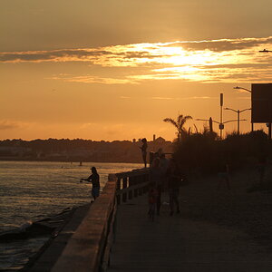
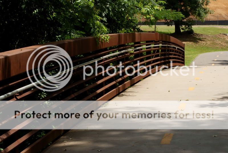
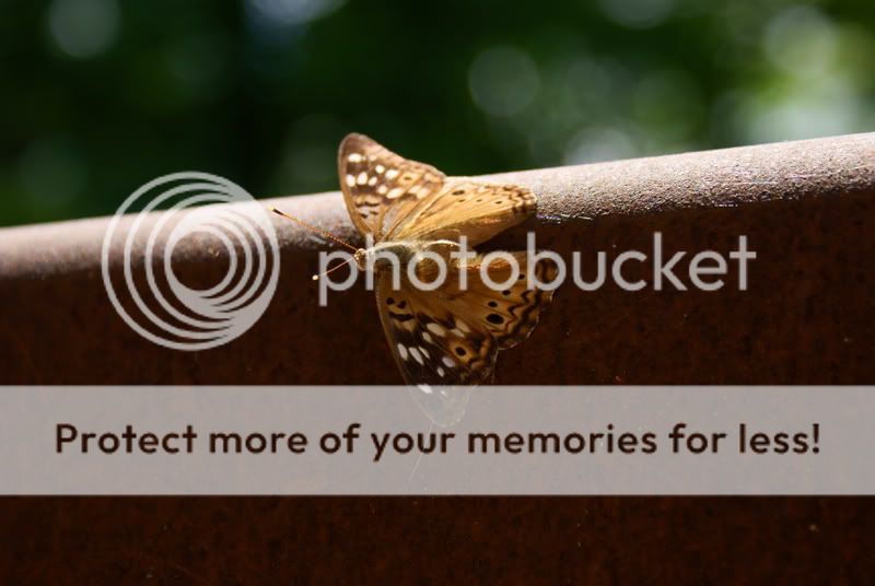
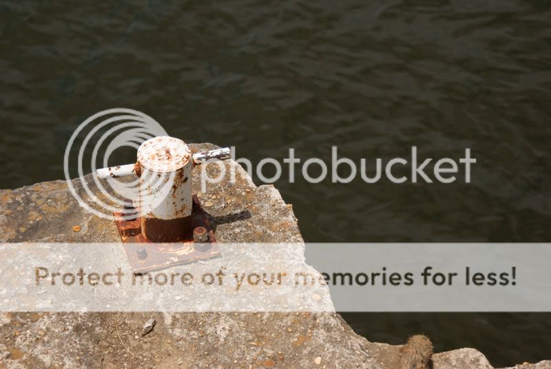
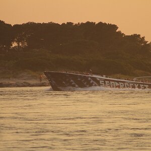
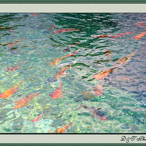
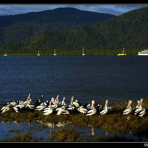
I was down near our river front here in Tuscaloosa, I took about 200 shots and these were the only 6 that I like, from what I read in everyone else's threads I must be getting the hang of it, lol..... As always take a look and let me know what I should be doing to make these better....

1.
Alabama.jpg


2.
BlackWarrior.jpg


3.
bridgewithsky.jpg


4.
bridge.jpg


5.
butterfly.jpg


6.
dock.jpg


Thanks in advance!
 
Wow, 40 views and no comments......they must be so amazing that words can not describe them :) ...........

Seriously though, this newb needs all the help he can get.....
 
Well, I am also really new here, but I love the angle of the distressed sign in #1 and I really want to check out the end of the trail on #3 (seriously, it just pulls me in). #2, the top cloud just bugs me; I would crop it out.

So, totally feeling based, nothing technical b/c I am too new to have a clue there. :)
 
Welcome back, C&C per req:1. An interesting image; I think I would have preferred to see both sides of the sign as opposed to having the left cropped off. Note that your camera's light-meter has been partly fooled by the brightness of the sky, and that the sign itself is actually under-exposed slightly. Additionally, the green foliage on the right is somewhat distracting; a slightly different shooting position could have eliminated this, and just left a fringe of sky around the sign.2. A nice image and good use of lines (the shore and the fence) to move the eye around the pictures. The water toward the left foreground is a little dark however, and the image needs straightening. Since you'got a curve in the river, you can't use the bank, but the light-pole on the right could be used to set the image straight.3,4. Both well composed, but suffer from over-bright highlights and too-dark shadows. A levels and curves tweak could help tame this.5. A nice macro, however there's a lot of space in the image that doesn't really contribute. This could be cropped off, leaving (relatively speaking) more butterfly and less 'nothing' for the eye to look at. I understand that these sorts of captures are 'take what you can get', but notice the very hard shadow line; brights on top, deep shadow on the side. As well, because of the angle, and the limited DoF not enough of the instect is in focus. Ideally you want to get him when he's flat vice 'bent'.6. Good composition, and about 1/2 stop over-exposed, but really it doesn't say much to me I'm afraid.Just my $00.02 worth - your milage may vary.~John
 
The last photo doesn't really do much for me - the subject matter/focus point just doesn't seem interesting to look at. Maybe if it was photographed from a more unusual point of view.

As mentioned, 5 would have been better if you could have gotten closer and cropped all the empty space out.

The bridge photos are good and probably my favorites out of the bunch. But then I really like bridges for some reason.
 
I like the 2nd one.. Looks like it could have been a good HDR or something along the lines of that nature.. cause it looks like a good image.. just a little under exposed.


Btw.. Roll Tide.
 
Honestly, they don't do anything for me (other than let me notice you have some sensor dust). Doesn't mean that there is anything wrong with them, they just don't "reach" me in any way.
 
I like them a lot but on a couple of them its hard tot ell what you are focussing on , but i like a mystery keeps my mind going . Great job
 

Most reactions

Back
Top