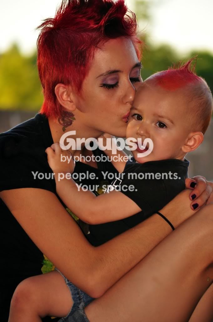
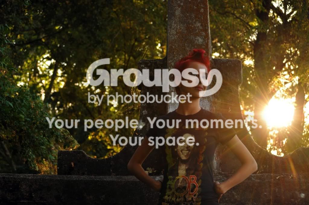
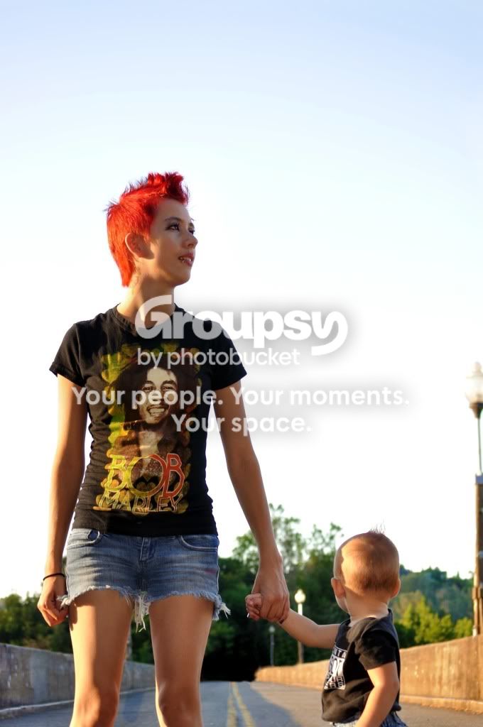
I haven't seen other images either...but a few thoughts. A BIG pet peeve of mine is a shadow showing up from on-camera flash like in #2. I don't really mind the cropping in #1 but it seems really flat and underexposed. #3 the sun looks cool there but the overall composition feels awkward to me. Maybe try moving her to the left side, or have her sit on the left side up top...or maybe leave her where she is and make it a vertical composition cutting off some of that on the left. #4 feels like there is way too much head room...and it seems strange to me that she's looking off to the right, and most of all that the child is looking backward, and the light post in the right corner feels like it was a mistake there too.
My 2 cents too. Keep practicing. What I like to do is find a really great photo that I like, and try and dissect how they did it, try to find where the lights are, whether it's the sun and a reflector or studio lights etc. You can use the eyes to see where a front light is placed, and look for rim lights around the hair and shoulders if it's a back light.
Good luck!
- Diddy



 But there is something I really like about it!)


 Good job though! Keep shooting!!