Ah, you do want C&C. (Noob on this site, so still unclear what the local rules are. Don't want to offer unwanted critiques and get my knuckles rapped...)
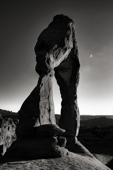
-I love the first one. The perspective and the tone give it a nice moody feel.
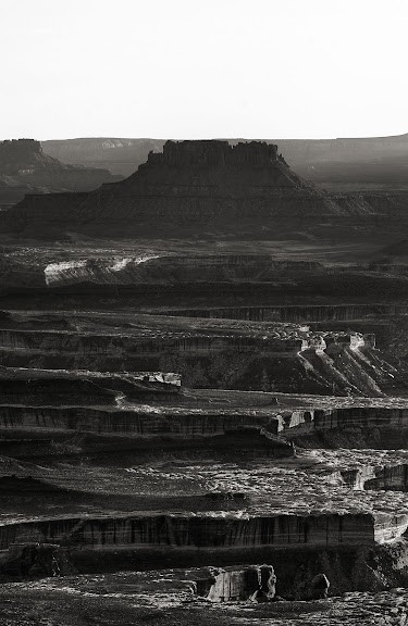
-I'm not the biggest fan of the second shot. I'd like to see more contrast in the undulations of the canyons. I don't like the large white rectangle at the top which is the sky. (Honestly, it took until the second or third time looking at that shot before I realized the sky was there. That white rectangle, with its bottom aligned so nicely with the top of the outcropping, blended in a bit with the grey background of this page and seems like it's just extra canvas.) This image would have benefited from a change in perspective (though I'm sure you were limited in your options). Go lower so that the outcropping sticks up into the sky rather than aligning with the horizon, or or higher so that the ground behind the outcropping is visible and you can crop out the sky entirely.
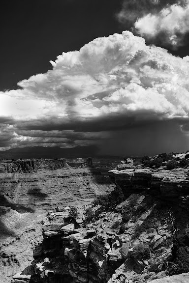
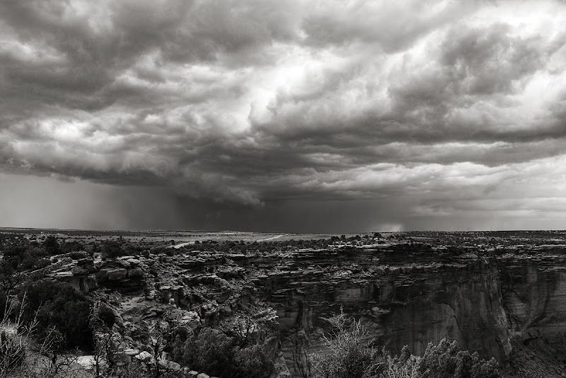
-I think the third would benefit from a bit more contrast (get a bit more white into the clouds). I also would crop to move the horizon up or down. As it is now the image can't decide which is the focal point, the sky or the canyon.
-The fourth would also benefit from a bit more contrast, but I love the perspective. Exactly the point I was trying to make about the previous image!
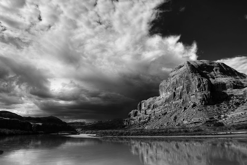
-For the fifth...again, more contrast would help bring out some cool detail in the clouds. Maybe take a look at cropping to a portrait orientation on about the middle third of this image, a little tighter to remove some of the foreground. See how that looks as far as playing up the storm going on in the distance...
")


![[No title]](/data/xfmg/thumbnail/32/32635-be18e952e67667cbb1525b4b057b6423.jpg?1734162121)
![[No title]](/data/xfmg/thumbnail/37/37604-7ad625e983f92f880eb65a264eeef5e4.jpg?1734170732)
![[No title]](/data/xfmg/thumbnail/37/37492-bafc92488a1ab17e4ca6603ee5b38376.jpg?1734170633)


![[No title]](/data/xfmg/thumbnail/32/32637-865ab9beec7e00237b64e4fcb8fe947f.jpg?1734162123)
![[No title]](/data/xfmg/thumbnail/37/37605-90c8efaef5b7d1f52d4bf8e7dfd33673.jpg?1734170732)


![[No title]](/data/xfmg/thumbnail/37/37602-1ef8dbb1c2d0e4ff347ee65d328c3603.jpg?1734170730)