wackii
No longer a newbie, moving up!
- Joined
- Mar 11, 2012
- Messages
- 375
- Reaction score
- 140
- Location
- Southern California
- Can others edit my Photos
- Photos NOT OK to edit
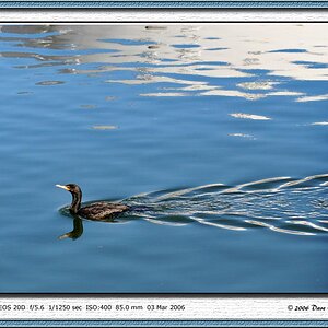
Awesome! Love #1
Follow along with the video below to see how to install our site as a web app on your home screen.

Note: This feature currently requires accessing the site using the built-in Safari browser.
I have to agree, #1 is just great, love the colors. and the processing seems to be very well done. its right on the edge of being a little too clean, but I like it.
if anything maybe a little less "clean" not sure if you used like a topaz clean or luminance? either way I try to be careful when I use it to get enough clean to cleanup the background noise brought on by sharping yet not too much as you start to see strange and un-natural things happen in branches look a little too fake and smooth. but really its a mater of preference and your own processing look. I like to try to keep most of my images on the edge, as they still look very real, but that very very slight tough of art smoothness. if that makes sense.
I guess the other thing to look out for if you do selective sharping or selective noise reduction, is watch out for that crisp edge on the subject or in focus objects and background. sometimes that makes it look a bit un-natural
but really the first image is great as is, I wouldn't change it. some images I do the same, make them look a little bit cleaner for the artsy type look
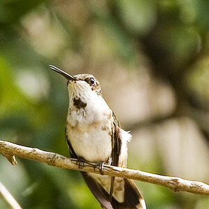
Oh good! Another bird photographer to try and emulate. These were delightful.
")
I have to agree, #1 is just great, love the colors. and the processing seems to be very well done. its right on the edge of being a little too clean, but I like it.
if anything maybe a little less "clean" not sure if you used like a topaz clean or luminance? either way I try to be careful when I use it to get enough clean to cleanup the background noise brought on by sharping yet not too much as you start to see strange and un-natural things happen in branches look a little too fake and smooth. but really its a mater of preference and your own processing look. I like to try to keep most of my images on the edge, as they still look very real, but that very very slight tough of art smoothness. if that makes sense.
I guess the other thing to look out for if you do selective sharping or selective noise reduction, is watch out for that crisp edge on the subject or in focus objects and background. sometimes that makes it look a bit un-natural
but really the first image is great as is, I wouldn't change it. some images I do the same, make them look a little bit cleaner for the artsy type look
In processing I had bumped up the luminance slightly and my clarity.1 in the first post is spectacular, everything about that shot is spot on.
2 I'd have liked to have seen cropped a bit closer to the bird, I know you are giving a bit of room and compositional stuff but I think that ones colouring is spectacular enough to warrant being really big in the frame.
In the second post, again great images. The only possible thing I think I could say is that in the middle one the wing tip is cropped off, but you know that yourself. There is no other possible thing I could critise these for, and they are all well above my league.
That last one is simply brilliant, I've never seen an osprey swimming before!