- Joined
- Aug 2, 2015
- Messages
- 2,169
- Reaction score
- 1,774
- Can others edit my Photos
- Photos NOT OK to edit
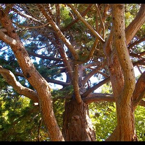
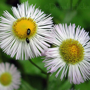
D850 (1st Shot)
f/3.5
ISO 64
1/40 Sec.
70 - 200 mm - f/2.8E FL ED VR
150 mm
Off Camera Light Center
(Processed In LR & Silver Efex Pro 2)
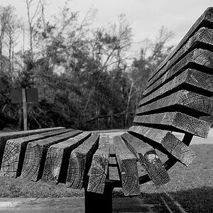
D850 (2nd Shot)
f/3.5
ISO 64
1/25 Sec.
70 - 200 mm - f/2.8E FL ED VR
130 mm
Off Camera Light Center
(Processed In LR & Silver Efex Pro 2)
I attempted with these shots to clone out that funky "catch light." Hopefully, it does not look to terrible.


Thanks For Looking Any Comments/Criticism Will Be Appreciated.
Enezdez
f/3.5
ISO 64
1/40 Sec.
70 - 200 mm - f/2.8E FL ED VR
150 mm
Off Camera Light Center
(Processed In LR & Silver Efex Pro 2)
D850 (2nd Shot)
f/3.5
ISO 64
1/25 Sec.
70 - 200 mm - f/2.8E FL ED VR
130 mm
Off Camera Light Center
(Processed In LR & Silver Efex Pro 2)
I attempted with these shots to clone out that funky "catch light." Hopefully, it does not look to terrible.
Thanks For Looking Any Comments/Criticism Will Be Appreciated.
Enezdez
 You can't win! I must be in a picky-picky mood this morning or something.
 ")