MechanicalClone
TPF Noob!
- Joined
- Jul 22, 2014
- Messages
- 11
- Reaction score
- 3
- Location
- On tour
- Can others edit my Photos
- Photos OK to edit
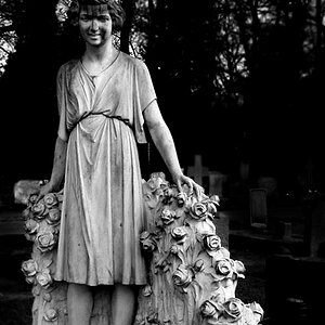
Here is another oversharpened statue.
Here's what I don't like about this, the trees in the bottom left corners looks like crap and the top left corner of the monument has darker lines that I dislike. I could of done a better job on removing the white halos too.
I think I like oversharpened stuff to much, I'll have to learn to back off on the sharpening\highpass-overlay.
What else don't you guys like about this?
")