DGMPhotography
Been spending a lot of time on here!
- Joined
- Mar 23, 2012
- Messages
- 3,160
- Reaction score
- 717
- Can others edit my Photos
- Photos OK to edit
Here's another selfie.


Based on this photo of Percival Graves from "Fantastic Things and Where to Find Them."
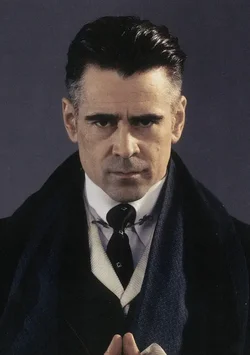
Based on this photo of Percival Graves from "Fantastic Things and Where to Find Them."



![[No title]](/data/xfmg/thumbnail/42/42487-e35b2848c41aeeb5a93f21809f036a1d.jpg?1734177009)
![[No title]](/data/xfmg/thumbnail/34/34135-27c00b73b314c3811e6eded0520a40a2.jpg?1734164674)
![[No title]](/data/xfmg/thumbnail/42/42486-757c2978c4ecfb0e9dbfca10a0e2d240.jpg?1734177008)
![[No title]](/data/xfmg/thumbnail/34/34137-37e6e29a844c1214e5b14ce322c7b716.jpg?1734164686)