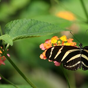
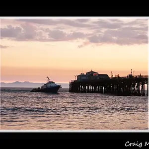
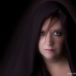
the second is great, color is excellent and the sharpness is on point.
in the first one it would have been better if they were all in focus (the bottom and right side of the middle one in the bottom row and the top left of the left most)
edit: sorry i thought this was in the critique forum...pm me if you would like me to remove my critique. i apologize :blushing:



 It's nice to see a photo post from you too.


![[No title]](/data/xfmg/thumbnail/38/38262-10a9668da9a2b36a92cddde57caf87bc.jpg?1734172150)
![[No title]](/data/xfmg/thumbnail/42/42461-e2a94a39b9483a804af86010fc52244b.jpg?1734176997)