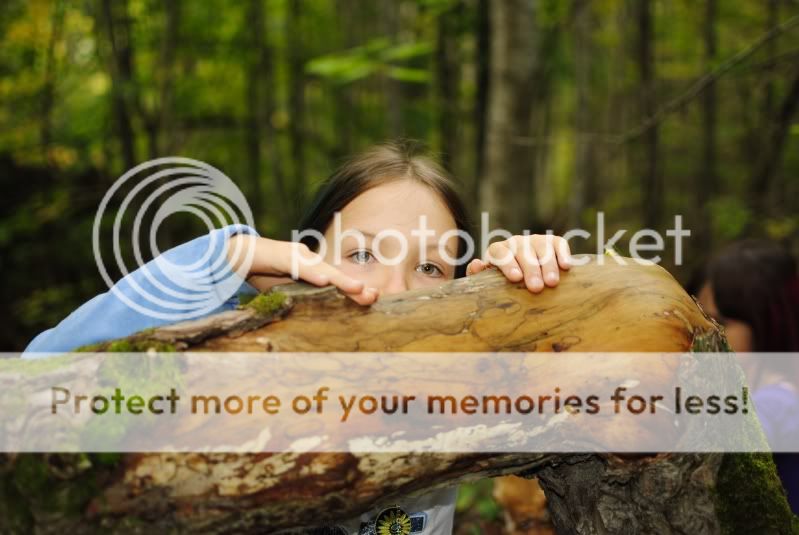
1. A cute idea, but I would like to see the composition changed slightly, so that there was more of her face visible and that the bottom was cropped just enough to remove the 'open' space where you can see her shirt. As well, it seems slightly soft overall to me.
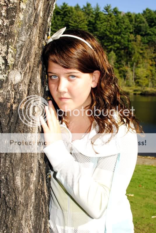
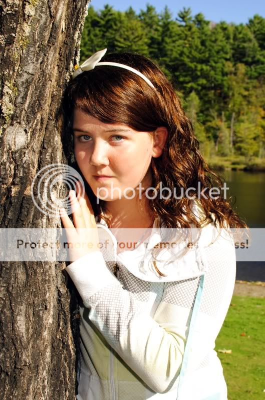
2. As mentioned, some exposures issues. Her shirt has blown areas, as well as hot spots on her cheek and nose. This was a tough shot, and you've done well, but the use of a reflector or fill-flash image left would have helped greatly. As well your background is a little too focused, and rather distracting.
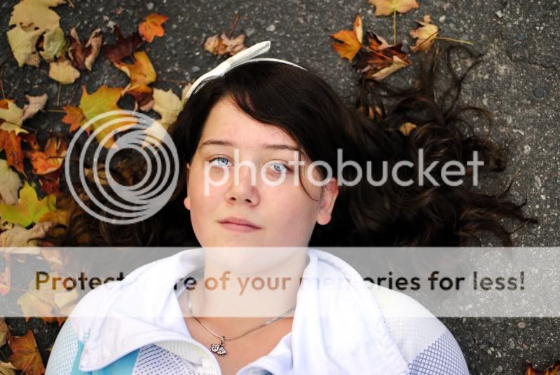
3. Cute; I would have preferred to see more leaves, especially image right, and a slight brightening, as the detail of her hair is lost. I might have removed her hair bow for this one, it's a little hard to see exactly what it is.
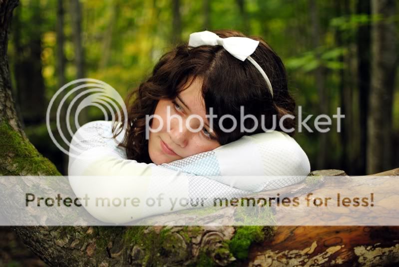
4. A cute, rather whimsical image with good exposure and background.
Some nice work; I think both #1 and 4 would make excellent square crops.
Just my $00.02 worth - your mileage may vary.
~John
")


![[No title]](/data/xfmg/thumbnail/35/35265-c9ea3efd2c618a57ea136e63ad106880.jpg?1734166927)


![[No title]](/data/xfmg/thumbnail/36/36666-189f65b1addbb68da2a43dc6f7206a01.jpg?1734169172)


![[No title]](/data/xfmg/thumbnail/36/36664-a1f71b488f6761523649a87f8465fc3d.jpg?1734169172)

