BoRyan
TPF Noob!
- Joined
- Apr 11, 2013
- Messages
- 20
- Reaction score
- 0
- Location
- United States
- Can others edit my Photos
- Photos NOT OK to edit
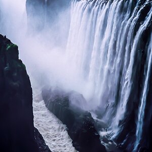
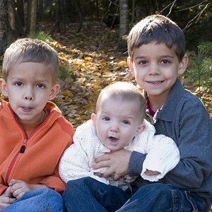
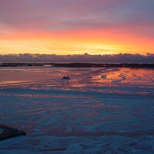
Going "out of the box" for me on this. Thoughts, please?
All color:

Thanks in advance!
All color:
Thanks in advance!
Last edited:


![[No title]](/data/xfmg/thumbnail/42/42253-fef7e43227f484b1a95dd6d85c03bd40.jpg?1734176623)