Years ago we would get a similar effect by selecting a print paper that would print in a slightly warmer tone or cooler as the case might have been. Same negative yielding different results.
I prefer the warmer one.
I see merit in both and believe it would only be a matter of personal taste.
Yup...cold-tone B&W versus warm-tone B&W...a long running argument! In the past I tended toward the cold-tone look, but as time has passed, have moved more toward slightly warmer B&W looks.
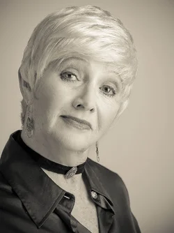
I took a shot at the original file. Made a copy of the dust spotting settings on the blouse. On most of these, I opened up the shadows in the black blouse, then burned the lower left corner of the blouse back down. Here are my thoughts on the various edits of this lovely woman's portrait
1.
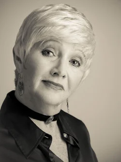
Edit 1-Adobe Lightroom's "Creamtone" preset, modified with the shirt burn-down. Recently I have been using Creamtone as my brown-type B&W toning. I like it. I adjust clarity and brightness and contrast as-needed.
2.
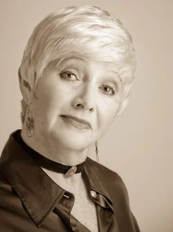
Edit 2: Lightroom's "Selenium" preset. To me, this has a delicate, ethereal quality to its toning.A traditional, old-time selenium-like look.
3.
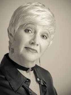
Edit 3: Green Filter preset plus Ultimate Fighter Light preset. I personally like the green filter to make lipsticks look good, yet natural, in many of my B&W conversions in Lightroom. The Ultimate Fighter filter removes some high-frequency detail and makes the tones a bit more, well, bold, let's say. I often use U.F. as one of my secret seasoning ingredients, and then combine it with one or two other presets. I personally think this is a gorgeous conversion.
In conclusion: start with a great model, aim a decent light at the subject, and there's a hundred ways to convert to B&W. It's all a matter of the subject, the desired rendering, and personal taste.





![[No title]](/data/xfmg/thumbnail/34/34083-76406a409bc520ead3cc11af09ebd257.jpg?1734164516)
![[No title]](/data/xfmg/thumbnail/32/32004-4455324f0b4b5cc318dd35877147ac47.jpg?1734160793)