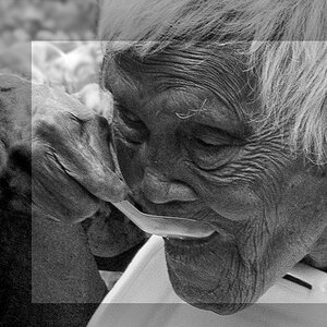
Rose is a little under exposed or so it seems to me. Personal opinion I guess.
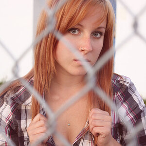
The B&W portrait... need more space in front of her face. There is more behind her than in front of her. Should be the other way around. Make sure that the bridge of her nose doesn't block out the opposite eye. Probably would have worked a little better if you would have moved a little left and/or got her to turn head more toward you and tilt/tuck chin in, then you could get more of the other eye and maybe a smile. Fill flash would work good here also.
Rose is a little under exposed or so it seems to me. Personal opinion I guess.
The B&W portrait... need more space in front of her face. There is more behind her than in front of her. Should be the other way around. Make sure that the bridge of her nose doesn't block out the opposite eye. Probably would have worked a little better if you would have moved a little left and/or got her to turn head more toward you and tilt/tuck chin in, then you could get more of the other eye and maybe a smile. Fill flash would work good here also.
I sorta agree with you on the rose. Not really sure though, I like it the way it is.
As for the portrait. This wasn't a photo shoot, it was just me walking around with my camera at a party. I really only intended for them to be snapshots, but I liked her pose, and expression in this one.
I like the rose. In the portrait I don't like how the face is too jammed into the upper left corner. And the top of head is missing. I really like everything else about it
I like the rose. In the portrait I don't like how the face is too jammed into the upper left corner. And the top of head is missing. I really like everything else about it
I really like the 1st one. Love her facial expression that goes well with you taking more of her back. Look like she saw something or someone that excite her and the view of the back make it more interesting and mysterious. Making us as observer wondering what it is. :thumbup:

![[No title]](/data/xfmg/thumbnail/30/30881-c36788e79b12973b7bf57c94b46961e9.jpg?1619734495)
![[No title]](/data/xfmg/thumbnail/30/30878-f33da8abe01acde1dcee7898f41310e1.jpg?1619734493)

![[No title]](/data/xfmg/thumbnail/42/42277-63576745f84be96df79b94ca0f49e00b.jpg?1619740085)