I like the darkness, the extremes of the roof to the shaded patio. For my taste and my monitor, maybe, just a smidgen of lightening in the patio and side wall and less than a smidgen of contrast/highlights in the snow. The roof is like a beacon signaling a safe harbor in the dark forrest.
Looking at the enlarged version the detail in the dark areas is all there, so the contrast correction is an easy one. the increased detail would definitely put this in my 'fine shot' category. As it is I agree with those ahead of me...it is too dark.
this is a screen grab, but it is more or less what I was talking about...a little more illumination back in those trees, not much but a little. I really like the composition..
I prefer the original picture. To me it is not about the detail but feelings. Don't get me wrong, each of presented versions is enjoyable, but each by gaining something is loosing something else. I think, eventually it is up to the author, what he wants to convey to viewer.
The main reason I like that second one so much is that it truly has an 'Ansel Adams' feel about it. It has a COMPLETE tonal range with no losses in light, or dark zones. Really a remarkable shot in that respect.


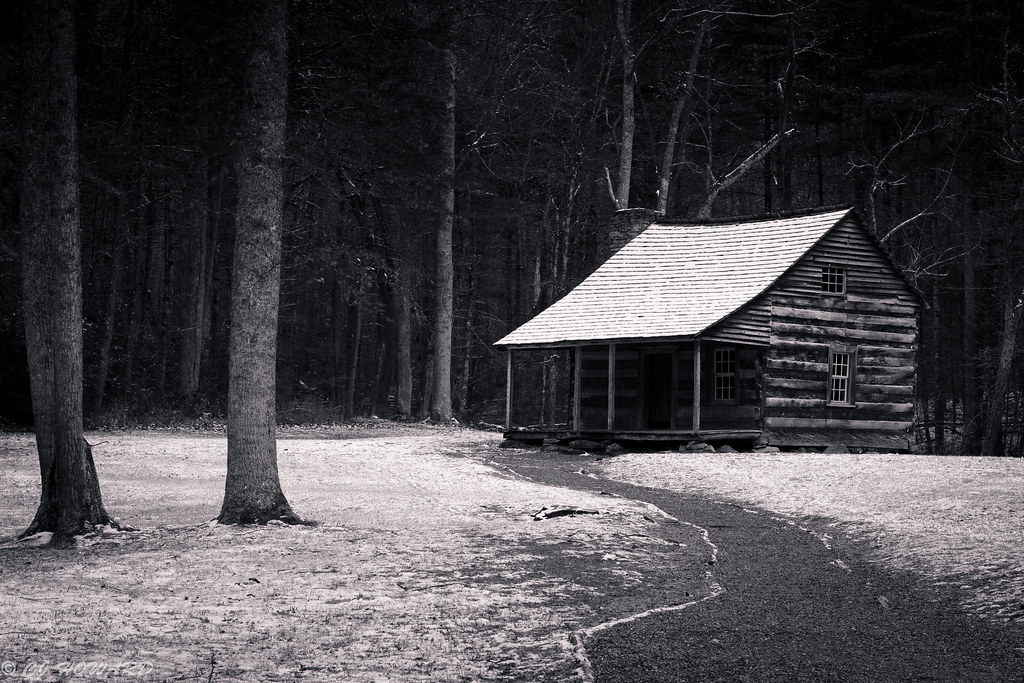 IMG_6497


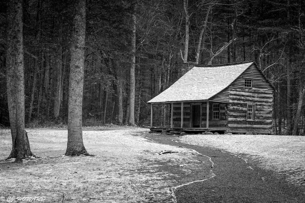 IMG_6497 2





![[No title]](/data/xfmg/thumbnail/35/35266-f58b019dadff6920c09071a847f052c3.jpg?1734166927)
![[No title]](/data/xfmg/thumbnail/35/35953-1a8b92df0115ff7026f31b78855ac815.jpg?1734167764)