Tight Knot
No longer a newbie, moving up!
- Joined
- Nov 30, 2010
- Messages
- 1,398
- Reaction score
- 159
- Location
- Boca Raton, FL
- Website
- www.lensphotoworld.com
- Can others edit my Photos
- Photos OK to edit
Hi all,
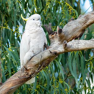
Here are a few edits of the same image I shot while out a few weeks ago, and was looking for some feedback on which one/s you preferred AND WHY (the latter is very important to me).
Looking forward to hearing from everyone.
1 2
2 3
3 4
4
Here are a few edits of the same image I shot while out a few weeks ago, and was looking for some feedback on which one/s you preferred AND WHY (the latter is very important to me).
Looking forward to hearing from everyone.
1
2 3 4
Last edited:
 .
.")
![[No title]](/data/xfmg/thumbnail/37/37612-989c0c475619355f32a5941a187cfa74.jpg?1619738150)


![[No title]](/data/xfmg/thumbnail/32/32179-99b00fe3df8a5ed7303ced76980128fd.jpg?1619735235)