Balance or, Why is the Center Weak?

amolitor

TPF Noob!
Joined
May 18, 2012
Messages
6,320
Reaction score
2,131
Location
Virginia
Can others edit my Photos
Photos OK to edit
We learned early that sticking the subject in the middle was a bad idea, mostly. This is expressed in older books on composition with sentences like "the center is weak".

I have developed a theory, based on quite a bit of readin' and thinkin', about why, which I think is illustrative and helpful. It has to do with "balance" which is another thing we talk about a lot in composition, without necessarily being able to explain it. Balance in this usage means the balance of equal and opposite forces. A line is opposed and balanced by another line. A dark mass is balanced by a light one. A rough texture is balanced by a smooth one. Balancing opposing forces creates tension and interest, without disturbing the equanimity of the picture. The picture remains, as it were, serene, while containing tension. At least, that's the theory.

This is why the center is weak: the center of the picture is naturally the fulcrum on which these balancing elements turn. If you stick something in the center, what can it balance against? This isn't an impossible problem to solve, and the center isn't universally bad. This probably isn't the only reason the center is weak, but it's the one that's on my mind right now.

So what does this mean? Anything?

The obvious consequence is this: It is not enough to push the subject off center, you must ALSO give it something to balance against.

I will close with some illustrations. I urge you to draw your own conclusions, and not accept mine at face value. It is almost inevitable that, having been told what to see, you will tend see what you have been told to see, so I suggest that you resist that now!
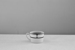
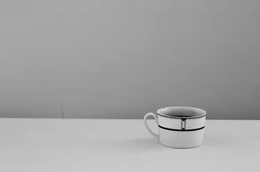
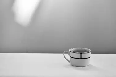

$Cup1.jpg$Cup2.jpg$Cup3.jpg
 
amolitor wrote: "
Balance in this usage means the balance of equal and opposite forces."

It certainly can be asymmetrically balanced by equal or unequal and opposite forces. In the illustrations above; there is a tiny flaw or stain on the backdrop that is trying for all its worth to balance against the cup in #2. Very nearly does it, too.

In #3, the bright spot does not quite balance against the cup as well as you had hoped. The reason is because light (color) objects "weigh" differently in composition than dark objects.

In asymmetrical balance, it is primarily the distance from the (imagined) fulcrum that enables a small object to balance against a larger (weightier) object.

Possibly one reason why the center is perceived as weak is because we humans naturally give more importance to whatever is in the center, and therefore "discount" the central object by effectively saying: "Of course it is important; is the central object, but what else is in the composition, and why is it there?"

 
Last edited:
You know, I saw the little mark there and I asked myself if I should clone it out and said 'eh, whatever' but it does weaken the illustration, doesn't it? Excellent job of taking an antagonistic and critical stance!

Hopefully the point comes through anyways.
 
You know, I saw the little mark there and I asked myself if I should clone it out and said 'eh, whatever' but it does weaken the illustration, doesn't it? Excellent job of taking an antagonistic and critical stance!

Hopefully the point comes through anyways.
Really?? :raisedbrow: I thought that was actually a pretty insightful and reasoned response to your post. I think both have valid points, and FWIW, my eye was immediatel drawn to that little dark line; possibly because over the years I've "trained" my eye to look for things like that. I suspect that your illustration might work well for non-photographers, but with a group who specialize in looking for the small details, no so much. That said, your point is well made.
 
Good illustration, but yeah...that stain or smudge on the wall...as I was looking at these I thought to myself, "Why the heck did he not clone that out?" When I think about compositional theories, I go back to the basics; the elements and principles of design. I do not believe in "rules". The illustrations you supply above are very useful I think, in showing how something as simple as a shape, or a highlighted shape, can visually offer balance, as well as contrast, as well as a value difference. The light pattern on the wall also offers variety, and dissonance.

elements and principles of design - Google Search
 
Excellent job of taking an antagonistic and critical stance!

Gee, Andrew, sorry! I didn't intend the post to be antagonistic and critical. I see how you could interpret it as such. Just trying to bolster your argument.
 
The first images does not have the cup in the center of the frame, though it is centered horizontally, it is not centered vertically.

Consequently the first image still has a measure of tension and drama.

Image frame shape also affects image tension and drama based on composition. The center of a square frame is not as weak as the center of a rectangular frame.

Not all images should be balanced, which also speaks to the goal of a visual sense of image tension and drama.
 
I see I have been misinterpreted ;)

I was genuinely pleased to see that you'd looked at my little pictures with a genuinely critical eye rather than simply seeing what I had suggested ought to be seen. I certainly did NOT take any remarks as critical of ME, in the slightest. This is genuinely a problem with texts on composition -- you are told what the effect of such and such is, and then shown an example. It's quite hard to determine how much of the effect is the result of such and such, and how much is simply the result of the suggestion planted by the text. You really DO need to look at the examples with a critical eye, you have to have a "Ok, smartass, show me. I think you're wrong." simply to counteract the suggestion.

This is precisely what I want people to do when they read this, and I am delighted that people are doing it, and seeing the flaws in the example. I didn't plant the flaws on purpose, that's simple incompetence, but that they are being noticed is a measure of success.
 
KmH brought up a VERY good point; the center of a square composition has a pretty good position; if it were two wrestlers, and the Square Frame Center was wrestling the Horizontal Frame Center, the square center would "pin" the other center! Wow..talk about a labored metaphor, eh? The center of a square frame actually has quite a bit of visual interest, and is quite strong. Square compositions also have "less" included; there is literally less space...there are no "left and right sides" to not use well; there are not unused top and bottom areas when the camera is a Rolleiflex or twin-lens Yashica, or when it's an iPhone using the Instagram application's built-in square crop mode. In many ways, one of the BEST things about Instagram is that is eliminates a huge amount of what would almost assuredly be dead, empty, worthless space in the snappy-snaps that many people take using their cell phone cameras. In square format, the center is actually quite strong...

I'm not trying to derail your thread, but just pointing out that almost all, and I mean almost all, of the historical paintings that were the subject of earlier compositional articles and books, were done using rectangular compositions as their major basis.
 
No worries, Derrel. This is obviously but a single thread that, when pulled, can open up a gigantic subject. It's a subject of great interest to me and, I think, to most of us, so nobody should feel (as far as I am concerned) the slightest bit of guilt over derailing.
 
Definitely worth amplifying as well that not all pictures need to be balanced.

Right now I am sorting and clarifying in my own mind a lot of this traditional stuff, the stuff necessary and desirable for making balanced, restful, "pictorial" pictures. I think of this archetypal picture as the "rule you need to know in order to break it". If you know how to make a picture that is in balance, that has these properties of "unity" and "repose" (whatever those mean, they were pretty specific terms in the 19th century, and they mean more or less what they seem like), then when you want imbalance, unease, disunity, you can make that easily and you know what it is that you're doing.

So, to circle back to the beginning, the point I am making here is that if you naively drop the subject at a 1/3x1/3 line, or follow any other of the handy rules for placing a subject in the frame, you run the risk of inadvertently creating imbalance. Your picture may have more dynamism than if you'd centered it (ignoring the insightful discussion of square formats and other exceptions, etc) but it may now feel off kilter and out of whack, or at the very least be less than it could be.
 
the point I am making here is that if you naively drop the subject at a 1/3x1/3 line, or follow any other of the handy rules for placing a subject in the frame, you run the risk of inadvertently creating imbalance.

I see that here sometimes. Typically a fairly new photographer has purposely placed the subject on a 1/3 line, believing that it is being done "correctly" according to the "ROT".

What is produced, however is imbalance without any saving grace such as "tension". Just off balance, with no obvious reason for it.
 
KmH brought up a VERY good point; the center of a square composition has a pretty good position;

It’s not often I use a square crop, but when I have in the recent past, every single time I’ve opted to place the subject in the center because it just looked better to my eye, despite all of the “rule of thirds” talk I’ve been exposed to over that same time period. I would just shrug it off as “oh well, looks like I’m going rogue here” but if the practice is actually rooted in compositional theory then I find that interesting, because that would make me an unwitting conformist, rather than a rogue. :D
 

Most reactions

New Topics

Back
Top