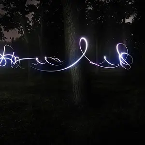
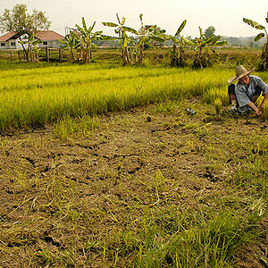
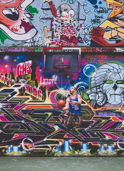
This is pretty cool. The dude is almost lost in the background, but since that's the point, it works well. Good composition, the ground at the bottom of the frame is really necessary to give it some weight at the bottom. Good concept, the dynamism of the guy works well with the art in the background.
Well done.





![[No title]](/data/xfmg/thumbnail/33/33495-c9bffdaa44506a6169a2faff5c7e086e.jpg?1734163607)