What's new

Beard and boats

sashbar

Been spending a lot of time on here!
Joined
Dec 13, 2012
Messages
3,044
Reaction score
1,183
Location
Behind the Irony Curtain
Can others edit my Photos
Photos NOT OK to edit
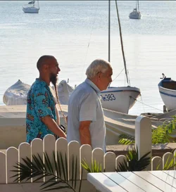
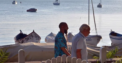
I really like this photo, even though it is not perfect, even with all that clutter on the right (I do not want to crop it) . Probably the right upper corner needs some darkening.. but I am not too good at PS, so do not know which tool to use here. Anyway, all these layers make it a good one, methinks. There are 9-10 layers that make it 3-dimentional. What do you think?
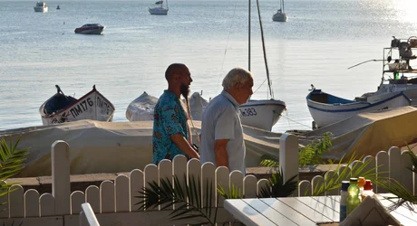



$Beard_web.webp
 
I know you don't want to crop (although I don't understand why), but I'll offer my opinion anyway. Here's an edit. To me, the figures need to be in a vertical format so the line of the beard and the line of the mast/sail on the boat in front of him are more prominent in the frame. The stuff I cropped seems to me just a distraction from this, especially what's along the right edge. I also tried to lighten the faces without blowing the whole thing out, but backlighting isn't your friend here. I might even be tempted to go the other way and make them silhouettes, which might bring out the lines and shapes even more. Anyhow, here it is for whatever it might be worth -

$Beard_web mod.webp
 
I know you don't want to crop (although I don't understand why), but I'll offer my opinion anyway. Here's an edit. To me, the figures need to be in a vertical format so the line of the beard and the line of the mast/sail on the boat in front of him are more prominent in the frame. The stuff I cropped seems to me just a distraction from this, especially what's along the right edge. I also tried to lighten the faces without blowing the whole thing out, but backlighting isn't your friend here. I might even be tempted to go the other way and make them silhouettes, which might bring out the lines and shapes even more. Anyhow, here it is for whatever it might be worth -

View attachment 54975

Thanks KenC. I do not want to crop because these two men are of secondary importance here, as strange as it sounds. They are just a part of this composition (and the beard just adds some interest) but what makes this shot to me is layers that make it 3-dimentional - the bottles, the fence, the people, the covered boat, other boats, the sea, the boats again - it all creates a lot of planes. Cropping just kills it. This photo needs some air and space.
Anyway, there is no reaction to this shot, so probably I will dump it. .. Or maybe not..
 
I'm going to weigh in. I agree with Ken and the crop is much better because like it or not the two guys are what stand out in this photo. Even without the crop they are what the eye goes to immediately. The boats at the top are not complete, the masts are cut off, so in my opinion they have little value to the overall photo. The bottles on the table are chopped off and barely visible. The main focus are the men, the two boats in the foreground and that neat popscicle stick look fence and bit of greenery. But - that's just my opinion.

Edit - Hmm all the talk of the bottles by others. When I clicked on the photo before it honestly did not open larger. I just tried again and it did open larger and now I do see the bottles on the table. But my opinion is still pretty much the same. - sorry.
 
Last edited:
IMHO this just looks like you were bored while waiting for your meal and decided to take a photo without moving or standing up.
 
I agree that a little bit of cropping could make it a more effective picture, but I don't like the one that was offered. Too close - it takes most of the context out of the picture, which in turn, takes most of the 'moment' out of the picture. For me at least. The too-close crop makes it look like it's just a snapshot of a dude with a funky beard. The wider shot makes it more interesting because it introduces a contrast. The beard seems out of place in the wider context.

I've never edited someone else's picture before, but for some reason, I decided to give it a go here. I did crop it - for the, the biggest distractions were the foreground. The light hitting the condiments on the table and the reflections from the palm fronds was really interesting, as was the symmetry of the palm frond along the semi-circle of the fence. Those things were pretty great, but my eyes went straight towards them and not towards the ostensible bearded subject. The tall boat on the far right was a bit too much clutter. I also slightly warmed the colors. Just a tad.

$Beard_web crop.webp
 
I don't have any problem with the clutter off to the right.

I'd lose the dead space behind the men, though. There's nothing interesting there.

Not sure I am loving the bottles as the foreground element, but it's what caught your eye, so there ya go. The highest contrast is on the bottles, so they're a visual point of interest, at the top of the visual hierarchy, but they're badly placed in the frame for that role and not very interesting as content.
 

Create an account or login to comment

You must be a member in order to leave a comment

Create account

Create an account on our community. It's easy!

Log in

Already have an account? Log in here.

Back
Top Bottom