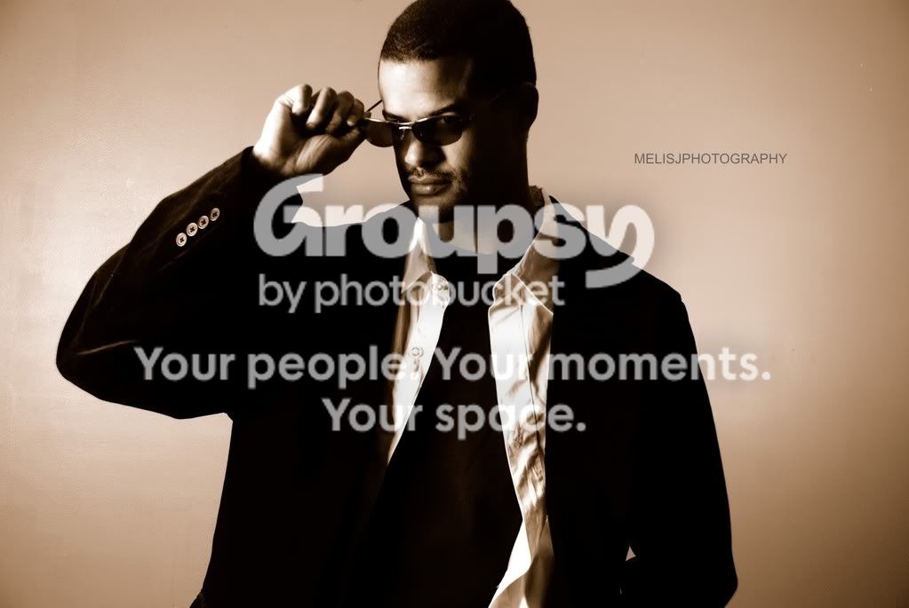
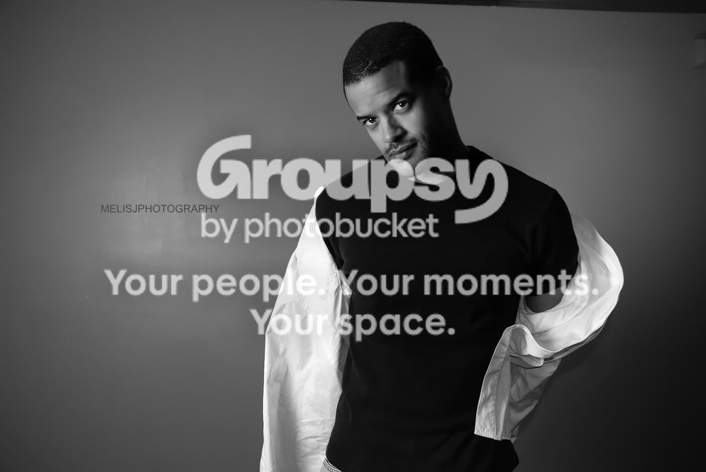
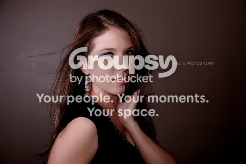
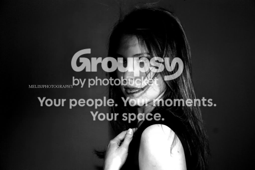
3rd photo, top right corner. Did you run out of background? Maybe clone out that black area.
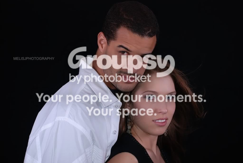
Nice poses, but i think he's a better model than she is. Her photographs look uncomfortable and quite tense.
very professional looking pictures!
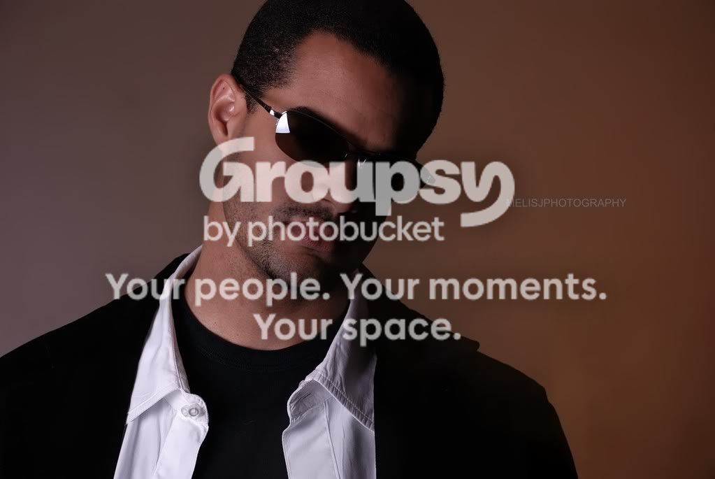
the ONE thing, IMO, i notice is the missing 'catch light' in the guys left eye in the last one.
but that's a VERY minor thing, that i'm not even sure is relevant.
Thank you everyone, I appreciate all the feedback and comments Yes more hair light would have been good, he got alittle lost within the darker background.
Some of the ones that will be going on the website will actually be edited a tad more for some minor changes, I just wanted to share these as they were.
I guess fashion may not have been the correct term but I was after more of a stylized shot rather. I've actually got some crazy materials and fabric I'd like to incorperate into my next shoot for a more avant garde type of style.
Great pictures!! One thing that I noticed is that the background is dirty. If you were going for that sort of look, IMO it should be more 'grungy'.. If not, PS would do wonders for the water spots.
A'course, take that with a kilogram of salt.... lol





 lol
lol


![[No title]](/data/xfmg/thumbnail/31/31757-4f5257d19be4e34c6bdcbd2519380d53.jpg?1734160480)