
- Joined
- Jan 6, 2007
- Messages
- 595
- Reaction score
- 72
- Location
- Portland, OR
- Website
- www.adversus.us
- Can others edit my Photos
- Photos OK to edit
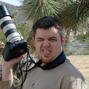
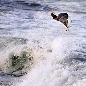
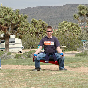
Titled, "February" and "March". Any feedback regarding composition would be helpful.

"March" by adversus.us, on Flickr

"February" by adversus.us, on Flickr
"March" by adversus.us, on Flickr
"February" by adversus.us, on Flickr


![[No title]](/data/xfmg/thumbnail/41/41799-fe172a668fba7717bf773664387d64aa.jpg?1619739897)

![[No title]](/data/xfmg/thumbnail/41/41797-ed370d68dae70f5b0a7252ec2d525912.jpg?1619739896)

![[No title]](/data/xfmg/thumbnail/34/34746-f8e4b50f9d9b0de43c95af3d2caf956b.jpg?1619736628)


![[No title]](/data/xfmg/thumbnail/42/42327-560f11a37bb209e9091c0fc9e1028cdc.jpg?1619740128)