Before and after, but... is it 'after' enough?

tirediron

Watch the Birdy!
Staff member
Supporting Member
Joined
Jul 8, 2005
Messages
45,747
Reaction score
14,806
Location
Victoria, BC
Website
www.johnsphotography.ca
Can others edit my Photos
Photos OK to edit
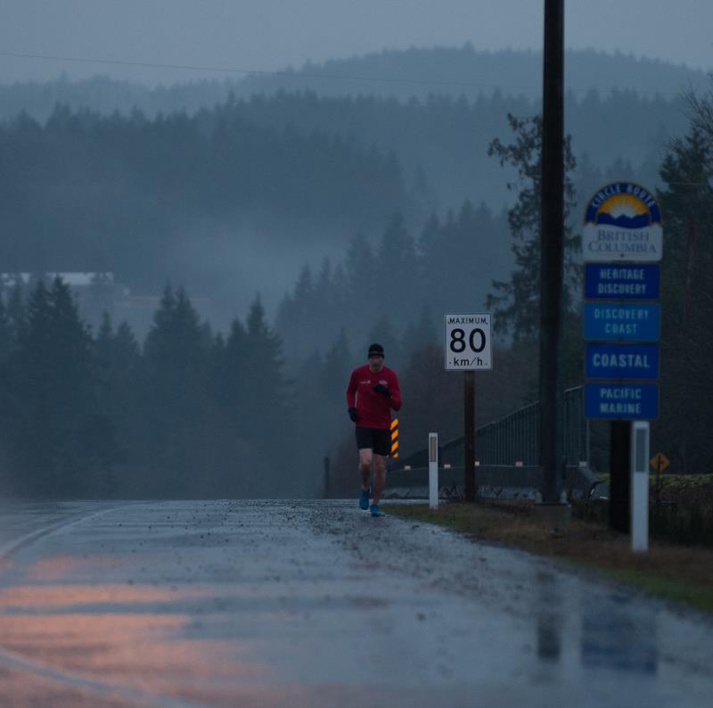
One of the images I shot yesterday during my Wounded Warrior run coverage struck me as having some potential. I wanted to produce an image which helps to convey the long, lonely and often difficult nature of the run these folks are doing.

I started with this (more or less SOOC) image, captured just after sunrise on a heavily overcast and drizzly morning:
Geoff_orig.JPG


and so far, have gotten here:
Geoff_final.jpg

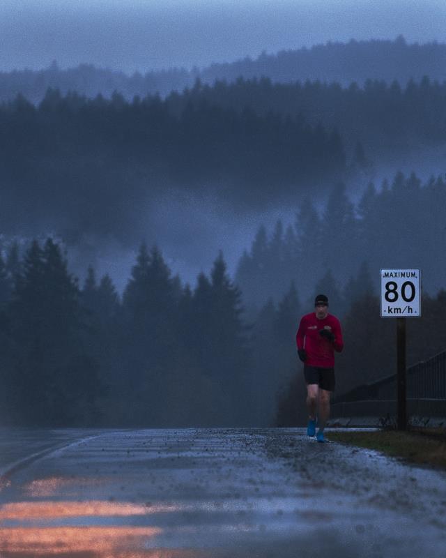
(For some reason these are both showing up darker than they should here). Basically tweaked the colours, cropped & removed a lot of the "stuff" out in an effort to try and portray a long, lonely stretch of road (The reality is this is a major intersection and there's a coffee shop, chippy, and dog-groomer's within 100', but.... )

So.. have I gone far enough? Too far? Wrong direction? All comments, suggestions, etc appreciated!
 
Interesting - I like the overall "feel" but I think I would have left the two white posts and more of the foreground and eliminated the speed limit sign. It's a great shot and there are so many possibilities ...
 
Thanks Ken; I spent a lot of time going back and forth over what to leave in and what to remove.. I might try some other combinations; my thinking was that the speed-limit sign on its own was more likely to represent 'the middle of nowhere' than some of the others....
 
I like that sign post on the right because it conveys distant things.
But the light post with vines on it and a strong black at the top, between the 80 sign and the sign post not so much. I looked at it with and without a lot ... can't decide. I guess without. :icon_scratch:
 
Trying different crops of the original, it's weird the psychological of it. Cropped high (less road in the foreground) there is 'less road to go' and he seems to be running faster.
 
I guess I'm in the minority in that I really like the first one better and would leave most of it alone. I think it portrays the story you're trying to tell better than the cropped version. I like the placement of the runner further back to show the long road ahead of him and by cropping you've lost that curve in the road which I also like. I much prefer the colors and mood in the original - you've got some decent detail in the mountains despite the gloomy day. I can see wanting to remove the signage but I think you lost more than you gained when you cropped off that side of the road.
 
I kind of wish he would have moved to the center of the road ;)

I think the first conveys "lonley" better for some reason.
 
I like the edit. I could do without the speed sign but I think you achieved the feel you were looking for.
Thanks Alex!
I like that sign post on the right because it conveys distant things.
But the light post with vines on it and a strong black at the top, between the 80 sign and the sign post not so much. I looked at it with and without a lot ... can't decide. I guess without. :icon_scratch:
Well... you're a lot of help! :p

Trying different crops of the original, it's weird the psychological of it. Cropped high (less road in the foreground) there is 'less road to go' and he seems to be running faster.
Good point; I hoped that some of that was conveyed by the apparent hill; as in, 'he's come a long way'...

I guess I'm in the minority in that I really like the first one better and would leave most of it alone. I think it portrays the story you're trying to tell better than the cropped version. I like the placement of the runner further back to show the long road ahead of him and by cropping you've lost that curve in the road which I also like. I much prefer the colors and mood in the original - you've got some decent detail in the mountains despite the gloomy day. I can see wanting to remove the signage but I think you lost more than you gained when you cropped off that side of the road.
Thanks! I didn't like losing the mountains but I really didn't like all the signage. I have to admit, I'm not 100% satisfied with the tones of the background, and that may change. I wanted it to look more like the colours my eye saw, but...
 
I like the edited version it looks less flat or dull but still enough to convey a dark and lonely feel and the lose of poles and signs gives a better sense of loneliness.I think cloning out the speed limit sign I think would add to a even more loneliness feel like no signs of civilization other then man and nature but at least taking out the Pole and signs adds to lonely,boonies In the middle of no where feel IMO.
 
I kind of prefer the before, with the roadside markers,and the blue informational signs, and the distant white building on the hillside, which ALL add a huge feeling of real distance, of real depth to the shot. When the roadside markers are cloned away, it makes the image feel very FLAT...it gives no real, honest,true sense of depth...it doesn't streeeeeeetch out the distance, it compresses the shot down to maybe 100 feet in depth. And also, the cloned-and-cropped version feels fairly right-heavy.

I agree...these look very dark. Like crack-of-dawn brightness. The roseate sun coming up color on the pavement lower left is wonderful. I am 100 percent with SquarePeg above: the original has much more of a storytelling quality to it--MUCH more of a framework on which we can construct a narrative..it is the entire body of the animal, the whole hog, as it were...the edit is a nice roast, all cut up and wrapped! Buuuut....these are still two, different, complete pictures, so....

As far as journalistic reportage, the second one is a total fakery job...but artistically, it's okay! The edit materially alters the context, and that might be okay, ya know?
 
This is a great exercise that shows how people can see the same image differently. Always interesting.
Definitely!

I like the edited version it looks less flat or dull but still enough to convey a dark and lonely feel and the lose of poles and signs gives a better sense of loneliness.I think cloning out the speed limit sign I think would add to a even more loneliness feel like no signs of civilization other then man and nature but at least taking out the Pole and signs adds to lonely,boonies In the middle of no where feel IMO.
Thanks!

I kind of prefer the before, with the roadside markers,and the blue informational signs, and the distant white building on the hillside, which ALL add a huge feeling of real distance, of real depth to the shot. When the roadside markers are cloned away, it makes the image feel very FLAT...it gives no real, honest,true sense of depth...it doesn't streeeeeeetch out the distance, it compresses the shot down to maybe 100 feet in depth. And also, the cloned-and-cropped version feels fairly right-heavy.

I agree...these look very dark. Like crack-of-dawn brightness. The roseate sun coming up color on the pavement lower left is wonderful. I am 100 percent with SquarePeg above: the original has much more of a storytelling quality to it--MUCH more of a framework on which we can construct a narrative..it is the entire body of the animal, the whole hog, as it were...the edit is a nice roast, all cut up and wrapped! Buuuut....these are still two, different, complete pictures, so....

As far as journalistic reportage, the second one is a total fakery job...but artistically, it's okay! The edit materially alters the context, and that might be okay, ya know?
Thanks Derrel! You're right, the image is 'right heavy' and intentionally so. The idea is that this image will be a promotional image for future advertising and I wanted to be able to place a block of white/light text in the lower left. You're right in that all editorial value is gone, however as it's intended to be an advertising/solicitation image... I think that's okay. Oh, and that 'roseate sun coming up colour'... that's a sodium-vapour street light over the intersection! :lol:

As an aside, a big part of my thinking in removing the signs and markers that I did is because in BC they are generally found at major intersections, and highways nearer to "civilization". Once you get away from the populated areas, speed signs and distance boards are really all that you will normally see. That said, I will play with this some more.

REALLY appreciate all of the input so far!
 
For my money, I think your edit went overboard on the orange reflection. I think it would be better if you remove that altogether, and then decide on the signage, etc. I'll take the signs over the reflection.
 

Most reactions

New Topics

Back
Top