What's new

Beginner, critiques and advice wanted

Animaniac888

No longer a newbie, moving up!
Joined
Jun 27, 2012
Messages
199
Reaction score
23
Location
USA
Can others edit my Photos
Photos OK to edit
Sorry that this is about my third thread about this, but the second one was posted in the Beginner's forum and moved to the B&W gallery... Hopefully this one will be more permanent.

I'm pretty new to photography, having come from doing some hobby computer graphics for about a year or so. I picked up some basic composition from there, but I still have a LOT to learn.

1.
$dsc0235sd.webp

2.
$dsc0191c.webp
 
Last edited:
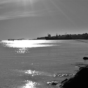
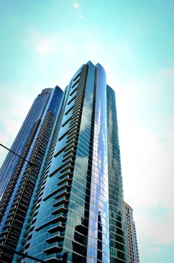
I really love number 1 cause of the angle, the sky is a little blown out but not by much at all.

other wise I love it :)
 
CC per request:


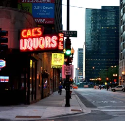
The good: The study of shape and geometry is nice. The perspective is interesting.
The bad: Crop is unbalanced, lots of negative space to the right. The street light protruding from left frame is a distracting element of this image. Highlights are pretty far gone, you probably need to use HDR when shooting a scene like this to capture the full dynamic range of the scene. http://www.thephotoforum.com/forum/hdr-discussions/285190-beginners-guide-hdr.html


The good: Nice isolation and depth, great subject.
The bad: I'd like to see the shot in black and white, the colors are a bit flat and uninteresting. Somehow, I'd like to see some separation between his left arm and the sign. If you have another similar shot, maybe that would be better. I don't like how the black suit blends into the black sign causing isolation tension. I'd probably also get rid of the silhouette and the end of the walkway since you have a strong leading line that takes you there.
 
Thanks Matchless for the compliment.

Thanks for the C&C Rotanimod. For the first image, the reason the highlights are so blown out is my fault, as I added quite a bit of contrast in post. I'll re-edit the image to fix both that and the crop.

The second photo is somewhat of a missed opportunity, as I didn't have my camera out in time to take a shot without the sign. He turned the corner after that. Not a mistake I will repeat, hopefully. I'll try to re-edit this one as well, perhaps separating the arm from the sign, saturating the colors a bit more, and removing the silhouette.

Anybody else?
 
Last edited:
Here's a new image:

3.
$dsc0196tz.webp
 
Last edited:
For #3, I'd crop out the 3.5% Rate advertisement. Also the center of the photo is a bit busy.
 
#1 : i really like this
#2: liked this too...but he is too much to the left
#3: good one :D
 
Thanks tushjain and Frequency. Here's another picture, probably the last one for this thread.

4.
$chicagonightandday2.webp

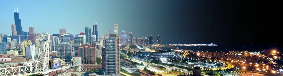
Chicago, Night and Day
 
Last edited:
Well...I like the angle and energy of the building shot...definitely not a fan of the "vignette" type look...but maybe that's really how the sky looked that day.
The second, good composition...I like the perspective. However the cartoonish/way oversaturated color thing is very unappealing to me...reminds me of my iPhone app pictures color effects. And there are serious focus/blurring issues...but it could be my monitor or image res.
 
Well...I like the angle and energy of the building shot...definitely not a fan of the "vignette" type look...but maybe that's really how the sky looked that day.
The second, good composition...I like the perspective. However the cartoonish/way oversaturated color thing is very unappealing to me...reminds me of my iPhone app pictures color effects. And there are serious focus/blurring issues...but it could be my monitor or image res.

Thanks for the C&C.

I'm going to have to re-edit the building shot, as all most of the problems with it were caused by postpro. As for the second picture, that's camera shake which is emphasized by cropping. Didn't have too much time to play around with settings because it's a street shot. I used color balance and then saturated the colors a little in postpro as well, so I'll have to re-edit that one as well.
 

Create an account or login to comment

You must be a member in order to leave a comment

Create account

Create an account on our community. It's easy!

Log in

Already have an account? Log in here.

Back
Top Bottom