Chann
TPF Noob!
- Joined
- Nov 7, 2011
- Messages
- 81
- Reaction score
- 5
- Location
- Little Rock, Arkansas
- Can others edit my Photos
- Photos OK to edit
I agree with previous C&C on 1 & 2.
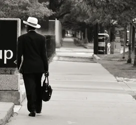
#3: I do not feel that a square crop works here. Go landscape or portrait. What bothers me on this is that the perspective vanishing point is hidden by the pole. The pole does not work here. Step into the street for the shot if possible.
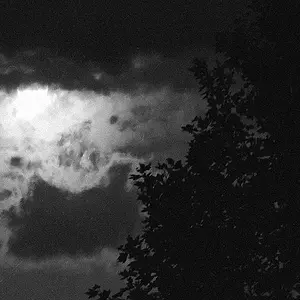
#4: Very cool and I like it. Neat and fresh concept that I cannot wait to try. You've expanded my horizon ... Thanks for sharing.
#3: I do not feel that a square crop works here. Go landscape or portrait. What bothers me on this is that the perspective vanishing point is hidden by the pole. The pole does not work here. Step into the street for the shot if possible.
#4: Very cool and I like it. Neat and fresh concept that I cannot wait to try. You've expanded my horizon ... Thanks for sharing.






![[No title]](/data/xfmg/thumbnail/42/42463-03457f0869c7510e6fb947b21de31aba.jpg?1734176998)

![[No title]](/data/xfmg/thumbnail/42/42461-e2a94a39b9483a804af86010fc52244b.jpg?1734176997)