
snowthedirtbub
TPF Noob!
- Joined
- Jan 24, 2008
- Messages
- 13
- Reaction score
- 0
- Can others edit my Photos
- Photos OK to edit
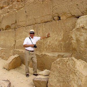
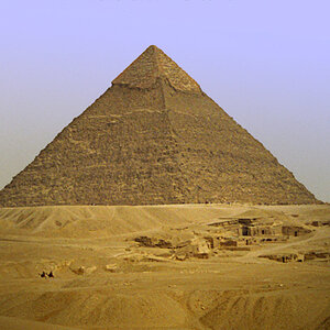
Took a trip to Europe in June and brought my camera along. This is the first time I really tried my hand at photography instead of just taking snapshots. These are some of my favorites because I find them interesting. One thing I learned going through my photos is that most of my photos are boring, so thats something I'm going to work on next time. Test photos have some minor editing, mainly auto correct/ auto tone/ auto color. Some photos were taken with a Nikon D40 and the others a D5200 with the kit 18-55 lens.
Looking for some C&C.
1) Protests in Berlin:
 2014 Europe 1256 by snowthedirtbub, on Flickr
2) Roman Coliseum:
 2014 Europe 940edit by snowthedirtbub, on Flickr
3) Pompeii Amphitheater:
 2014 Europe 862 edited by snowthedirtbub, on Flickr
4) Eiffel Tower

5)
 003 by snowthedirtbub, on Flickr
6) Beach in Turkey
 Turkey by snowthedirtbub, on Flickr
7) Notre Dame in Pairs
 DSC_0949edit by snowthedirtbub, on Flickr
DSC_0672 edit color by snowthedirtbub, on Flickr
8) Gravensteen in Ghent, Belgium
 DSC_0585edit by snowthedirtbub, on Flickr
9) View of Athens, Greece from Acropolis
 Athens City Edited by snowthedirtbub, on Flickr
10) Prague, Czech Republic
 2014 Europe 2129 edit by snowthedirtbub, on Flickr
11) Protest in Prague, Czech Republic
 2014 Europe 2062 edit by snowthedirtbub, on Flickr
12) Cologne Cathedral in Germany
 2014 Europe 1786 edit by snowthedirtbub, on Flickr
13) Lock of Love Bridge in Paris
 2014 Europe 1751 edit by snowthedirtbub, on Flickr
14)

15) Doors of La Sagadra Familia in Barcelona, Spain
 2014 Europe 1141 edited 2 by snowthedirtbub, on Flickr
16) Market in Toulon, France
 2014 Europe 1083 edit by snowthedirtbub, on Flickr
Looking for some C&C.
1) Protests in Berlin:
2014 Europe 1256 by snowthedirtbub, on Flickr2) Roman Coliseum:
2014 Europe 940edit by snowthedirtbub, on Flickr3) Pompeii Amphitheater:
2014 Europe 862 edited by snowthedirtbub, on Flickr4) Eiffel Tower
5)
003 by snowthedirtbub, on Flickr6) Beach in Turkey
Turkey by snowthedirtbub, on Flickr7) Notre Dame in Pairs
DSC_0949edit by snowthedirtbub, on FlickrDSC_0672 edit color by snowthedirtbub, on Flickr
8) Gravensteen in Ghent, Belgium
DSC_0585edit by snowthedirtbub, on Flickr9) View of Athens, Greece from Acropolis
Athens City Edited by snowthedirtbub, on Flickr10) Prague, Czech Republic
2014 Europe 2129 edit by snowthedirtbub, on Flickr11) Protest in Prague, Czech Republic
2014 Europe 2062 edit by snowthedirtbub, on Flickr12) Cologne Cathedral in Germany
2014 Europe 1786 edit by snowthedirtbub, on Flickr13) Lock of Love Bridge in Paris
2014 Europe 1751 edit by snowthedirtbub, on Flickr14)
15) Doors of La Sagadra Familia in Barcelona, Spain
2014 Europe 1141 edited 2 by snowthedirtbub, on Flickr16) Market in Toulon, France
2014 Europe 1083 edit by snowthedirtbub, on Flickr
Last edited:


![[No title]](/data/xfmg/thumbnail/37/37245-5f15b292311b21913f10cc41f40682ba.jpg?1619737952)
![[No title]](/data/xfmg/thumbnail/39/39293-55a527d2a9b287bf5e5b6d118abab22c.jpg?1619738958)


![[No title]](/data/xfmg/thumbnail/30/30986-0fbf9af8f70b46ce37aeb237ba68b573.jpg?1619734551)
![[No title]](/data/xfmg/thumbnail/38/38444-6063bb59cb410c520a1ccccbe58db9c7.jpg?1619738614)