What's new

Best way to blend a composit?

allison_dcp

TPF Noob!
Joined
Jun 14, 2012
Messages
274
Reaction score
25
Location
Ohio
Can others edit my Photos
Photos OK to edit
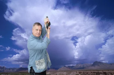
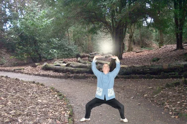
So my dad's wanting this type of thing........
$park2.webp$cloud-05.webp
and its obviously going to look like 2 separate photos, but I'm wondering if there is something more I can do in PP to make the blend work a little more. Please dont laugh at my attempt (ok maybe just a little:lol:).
 
maybe add some shadow in that first? and the 2nd maybe adjusting the bg and his colors to match more? the sky is so blue and his image isn't nearly as saturated or something.
 
thanks!
 
I can't offer technical advice here. I just wanted to say that your dad rocks!
 
in photo 2. I would suggest a different background. Well the same type but include more mountains and less sky. also don't "blend your sky into your mauntains instead just mask it in.
 
in photo 2. I would suggest a different background. Well the same type but include more mountains and less sky. also don't "blend your sky into your mauntains instead just mask it in.[/QUOTE]
I am inserting it using a mask, but am having trouble with making it blend better. Any advice?
 
If you want it to look believable, then it will take some work. One of the more obvious (but overlooked) things to think about, is that you'll want to lighting on the subject to match the lighting for the scene that they are placed into. So for example, if the light in the scene is clearly coming from the left, then the subject should appear to be lit from that side. If you can make it look like the lighting matches up (and of course, include a shadow if it would normally be seen), then that helps a lot.

But maybe even more important than that, is matching the brightness/contrast/saturation.

It looks like you've got the cut outs/extractions pretty clean, so I won't mention that.
 
The thing that makes any image look superimposed is the hard cookie cutter effect of stripping an image on top. Once the layers have been flattened you can use the smudge tool (very small brush) and smudge in the edges of the added image and it will help it to look more real. Lighting must be from the same direction as well.
 
The thing that makes any image look superimposed is the hard cookie cutter effect of stripping an image on top. Once the layers have been flattened you can use the smudge tool (very small brush) and smudge in the edges of the added image and it will help it to look more real. Lighting must be from the same direction as well.

AH! thanks:)
 
If you want it to look believable, then it will take some work. One of the more obvious (but overlooked) things to think about, is that you'll want to lighting on the subject to match the lighting for the scene that they are placed into. So for example, if the light in the scene is clearly coming from the left, then the subject should appear to be lit from that side. If you can make it look like the lighting matches up (and of course, include a shadow if it would normally be seen), then that helps a lot.

But maybe even more important than that, is matching the brightness/contrast/saturation.

It looks like you've got the cut outs/extractions pretty clean, so I won't mention that.
Thanks! It took for damn ever!
 
The thing that makes any image look superimposed is the hard cookie cutter effect of stripping an image on top. Once the layers have been flattened you can use the smudge tool (very small brush) and smudge in the edges of the added image and it will help it to look more real. Lighting must be from the same direction as well.
Couldnt you just select the person, contract the selection a pixel or few, and feather?
 
As Mike and Mully noted you need to make the lighting match up between the two different photos. And as mommy observed a big part of matching the light is shadows. Making sure you have believable shadows is crucial. You also want to match up the perspective. Same lens focal length/subject distance for each shot otherwise the composite won't appear real. Layer masks is the way to go, if you're using Photoshop you want to pay attention to the refine edge option for the mask.

Joe
 
As mentioned already several times, match light and shadow on both images being used, composite in layers and don't leave the edge of the cutout sharp against the background or it stands out as not being a part of the scene as a whole.

Here's another tip (don't know if it's been mentioned yet) - slightly blur the background to simulate DOF with the subject in focus. It looks too unnatural when everything in the frame is in focus on scenes like these. Where the subject is standing will need to have the same sharpness as the subject, so the best way to do that is to use a focus blur with a gradient mask.
 
The thing that makes any image look superimposed is the hard cookie cutter effect of stripping an image on top. Once the layers have been flattened you can use the smudge tool (very small brush) and smudge in the edges of the added image and it will help it to look more real. Lighting must be from the same direction as well.
Couldnt you just select the person, contract the selection a pixel or few, and feather?

this is how I clean up "cutouts" as we call them in digi scrap.
 

Create an account or login to comment

You must be a member in order to leave a comment

Create account

Create an account on our community. It's easy!

Log in

Already have an account? Log in here.

Back
Top Bottom