Hi allison,
All the above!!
Nice start on these images.
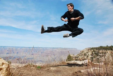
On the first image there is no shadow of him dropping behind him. That creates a visual disconnect for your viewers...so you need to make a shadow for him so he looks real in the environment.
I dont know what level you are at with Photoshop kind of stuff. I think im going to give you some specific detail...hope thats OK.
To create a shadow... you would do that by taking your cutout of him and control or command clicking on the thumbnail itself (its best if he's on his own separate layer)...to get a marching ants selection around his cutout. Now that he is selected...go to the bottom of the layers pallet and make a new adjustment layer called solid color. Choose black. When you make this new layer...the selection of your dad will create an automatic mask on this new layer. It will put the black color you created and make it perfectly fill in your dad. Its this new black shape of your dad that will become his shadow. Take this new shadow layer and drag it down below your original dad layer. Now you have the black shadow behind him in the image. Now you are ready to position this shadow.
To position the shadow...Do a control T for free transform... and pull that shadow down and slightly to the right. You will now see your dads shadow behind him. Make it smaller and offset it a bit. Bring down the opacity of the shadow layer so its not so strong...then...gaussian blur that layer till the shadow looks nice and soft and blurry. You might even put a gradient on it to make it look even more believable.
If this is getting too complicated and involved for you...I can make up a quick video showing you these steps being performed if you like. Sometimes its easier to show than to just tell.
Beside the shadow problem...In both of your images...your dad is too bright and a slight bit over contrasty. You may have to use a curve to bring down his brightness to better match the surrounding background image better...then he will look like he belongs in the outdoor image a bit more.
There is also a color temperature problem in both of your images...your dad is too warm (red) in color. The backgrounds you show are cool blue scenes...and you have perfect warm flash for a light source! This is an instant tell-tale sign of a mis-match. You need to add a bit of blue to his flesh tones and body to make it look like outdoor light instead of inside perfect flash. You can do this with a curve too... or a color balance adjustment layer. The brightness, lightness and the face color do not match outdoors kind of cool light.
To recap: there is no actual shadow on your dad in image 1... and he is too bright and too warm to match the outdoor look. In image two he is again too bright and warm...and there does seem to be a shadow behind him in that image caused by how the clouds look behind him...your dad is a really big guy to cast a shadow on clouds a mile away!!! LOL. He looks like he is standing in front of a picture mural because there is the look of a shadow. The clouds look only 10 inches behind him. The darkness behind him in the clouds needs to go away. Might be the easiest to move the position of the clouds or to use another image of clouds to cut in. the dark clouds make it seem like your dad is creating a shadow on them.
Everyone is at a different point in their skill set with everything they do. You have a great start on this project by having nice images and great cutouts. Now you need to do the fine detail matching work that makes these kinds of inserts look right. Some of the ideas on softening your dads edges are great above!
Just saw something else....He may also be a bit big in image two... and a bit small in image 1 considering the environment of the backgrounds. So, you may have to change his size to better match his visual environment. He is very small in the foot path...he looks like a midget and is too short and narrow in the path...and he is very big and close and upfront in image two. So you will need to scale your dad up in size in image one...and down some in image 2.
Who said this stuff was easy??
Cheers





![[No title]](/data/xfmg/thumbnail/32/32945-a29b33c040ad72e4b783ea5e431cec65.jpg?1734162786)
![[No title]](/data/xfmg/thumbnail/35/35952-55c8d42ec1c6ff0e13b45356cbf9c068.jpg?1734167758)
![[No title]](/data/xfmg/thumbnail/35/35953-1a8b92df0115ff7026f31b78855ac815.jpg?1734167764)
![[No title]](/data/xfmg/thumbnail/32/32946-74023d9d5e025fc03f754a05cb917646.jpg?1734162791)