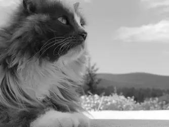
I like 3,4,and 5 the best. The first three look a tiny bit low in contrast; the whites could be a bit whiter and brighter, and the different tones could be a bit more, well, contrasty. I like cats. Jasper looks way cool.
Well, I could do three things:
1.) Go to the manual and keep it at black and white, keep it on close up, then change the shutter.
2.) I could lower the brightness
3.) I never said I didn't believe in editing photos - but I do try to avoid it if I can. But if I wanted to I could fix the contrast just by simply changing it in the basic photo fixer my photo viewer has.
I like the first one the best, because of the contrast between fur and clouds. As noted, the contrast could be a bit higher on these first ones, but not too much. Soft cat, soft clouds, soft tones, or something like that. I like all of the indoor cat. Nice visual pop, nice and close in. It's a style, and a visually pleasing one.