It's not that I'm against processing, but the way you've processed these and what it's done to the colour. I'm not sure you realise just how much you've subtracted from these images.
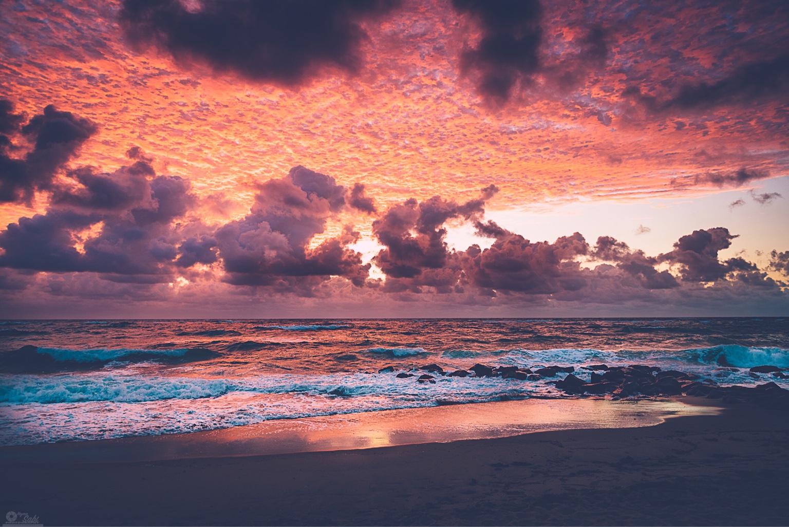
I find them all to have that very thin colour of over tone-mapped and over-saturated images. Look at the orange sky in all of them, that's what over-saturation does. It's a subtractive tool as in is subtracts colour, it does not add it. With saturation you remove the variety and depth of colour, the variety that added texture to the clouds, texture that's now gone which makes the orange look featureless and flat. The transitions between colour are abrupt because you've stripped all the subtle shades and pastels that used to exist and replaced them with blocks of virtually solid and saturated colour. Here is a section of sky in one of the images, you can see that it's been reduced to just four blocks of colour:
View attachment 125780
This is what I see throughout the image, very little variety in colour and just blocks of whatever dominant hues are left. Look at the sea in the first image, the reflections are a dominant red and the "white" water is a dominant blue, there's no other colour there and no graduation between the colours.
I've probably not explained it any better than I did here:
Is This Oversaturated?





![[No title]](/data/xfmg/thumbnail/41/41891-e5bba75ac5ce57c6892ade4cfc3f7d4c.jpg?1734176244)