Branching Out - a rare C&C request

Forkie

Been spending a lot of time on here!
Joined
Feb 14, 2011
Messages
2,292
Reaction score
920
Location
Chiswick, London, UK
Website
www.ianforknall.com
Can others edit my Photos
Photos NOT OK to edit
I'm only just really starting to photograph people seriously. I've been a product photographer now for nearly 4 years and I'm sick to death of it - so I'm slowly but surely starting to add stuff to my portfolio that is relevant to where I want to go, rather than where I've been, before I dare call myself a portrait/headshot/people photographer.

I have a few portraits/headshots in my current portfolio, but none of them really could be described as my best stuff, so I've been putting my feelers out for people who want a few shots done, I've registered on Model Mayhem and StarNow and am finding practice victims who'll pose for free.

A friend at work put one of his friends in touch with me who wanted some proper photos of herself because most of the stuff she has are iPhone photos "which are fine but I never look really nice in them", so we got together for a day in Camden Town in London and did some shots.

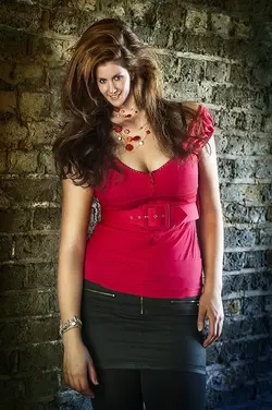
After 600-ish shots, this is my favourite so far. We got a few poses in this place and some others in a similar under-a-bridge place that I haven't got round to processing yet, but this, I think is a good start.

This is obviously the before and after - and I'd appreciate some opinions :)

The set up was just me and the camera. I didn't take the reflector out because I had no assistant to hold it and I have no portable power supply for my strobes, so this is purely natural light (we did some flash photography inside, I may put some of them up later when they're done).

There was no consensus on style - this was purely what I had in mind when I saw the original straight out of the camera. I like the "Twilight" style colouring and the stylised shading.

Settings were: ISO 640, Shutter 1/200, f/2

I used f/2 because I didn't want to raise the ISO any higher - 640 is about my acceptable limit on the D300s and I only just got away with 1/200 for some reason, the shots either side of this one had very slight, but enough-to-annoy-me motion blur.

I'd love to know your opinions, what would you have done differently in the original? Is there anything that jumps out at you in the finished one that I might have missed? Is the pose ok? How about the skin smoothing (not that she needed much!)? My choice of light direction?

x55vgn.jpg
 
You probably could have achieved the same with a lower ISO to kill some of the ambient light and then using two flashes (one of the subject, and one of the bricks behind the subject). It also seems like you didn't need f/2, considering the bricks still seem to be in the focal range.

see 1:02:00-1:20:00 or so:


I do like what you were able to make of it however. But notice his comment at 1:16:00 about PS ;)
 
Last edited by a moderator:
The way she's holding her head makes it looks abnormally large for her body. It almost looks shopped on. I think she needed to lift her chin here and maybe there needed to be more light around her neck. I find that black shadow around her neck to be off-putting and I think it adds to the general Giant floating head feeling I'm getting. Also, it looks like one of her arms is much larger then the other and I assume that's just the perspective from how she was posed. I like the way you warmed up the after shot and the color of her shirt is a bear to get correct so cheers for that. I think a reshoot (or if you have another shot with a better pose) and you'll really have something here.
 
It looks to me like you've taken the old "Head up.... chin out... chin down..." mantra just a little too far. As mentioned above this pose causes a severe case of giant head syndrome. Additionally, your low shooting position doesn't really work IMO; try and get up to eye level so that the subject isn't looking down on you. I would also try and turn the shoulders a bit so they're not quite so square, and don't forget to check for those pesky exposed bra straps!
 
You probably could have achieved the same with a lower ISO to kill some of the ambient light and then using two flashes (one of the subject, and one of the bricks behind the subject). It also seems like you didn't need f/2, considering the bricks still seem to be in the focal range.

see 1:02:00-1:20:00 or so:


I do like what you were able to make of it however. But notice his comment at 1:16:00 about PS ;)

Thanks for looking Braineack :). Two flashes would have been great if I'd had them. I have two strobes, but no portable power supply for them - the lighting here was purely the daylight coming from either end of the tunnel we were in. Although you're right about the ISO, I probably could have switched it down a stop and got away with it, but I feared even more noise from a darker photo than with the higher ISO.

If I'd had flashes, I'd have definitely used a narrower f-stop - probably around f/8-f/11 but I put exposure over noise in this instance.

I also totally agree with the fella in the video - however, I have no quarms about fixing it in Photoshop if I get it wrong ;) My motto in life in general is - if the result is the same, no one needs to know how you got there!


The way she's holding her head makes it looks abnormally large for her body. It almost looks shopped on. I think she needed to lift her chin here and maybe there needed to be more light around her neck. I find that black shadow around her neck to be off-putting and I think it adds to the general Giant floating head feeling I'm getting. Also, it looks like one of her arms is much larger then the other and I assume that's just the perspective from how she was posed. I like the way you warmed up the after shot and the color of her shirt is a bear to get correct so cheers for that. I think a reshoot (or if you have another shot with a better pose) and you'll really have something here.

I don't get the same feeling about her head as you, I think the shadow under the neck is consistent with the shadows throughout the shot which I think qualifies it a little (I hope!) but I do slightly agree about the arm now you've pointed it out - I guess her hair hides the fact that the shoulder nearest the wall is dropped, which doesn't help.

Thanks for your pointers - I definitely need to pay more attention to little details like this in future - I guess at the time it never occurred to me that her arm could look too big when the image in the 2 dimensional image.
 
I like the way you've processed it, I just don't like the pose. Not sure I could have verbalized exactly WHY until I read Whiskeyjack's and John's comments.
In addition to the large head effect they mentioned, it seems like because the lower shoulder is completely covered by her hair, you don't get a sense of just how much lower it is, and instead you just have this visual effect that she has one really, really long arm and one shorter arm.

Also, and I just don't think I can explain this well, there is just something that seems "clunky" to me about her posture. My daddy used to tell me sometimes that I was walking like I was behind a plow. This posture has that same clunky, rather than graceful, feel to it, for me.

EDIT: COMPLETELY missed that Whiskeyjack had already mentioned the arm thing. Don't mind me, I'm just gonna go see if I can find another cup of coffee... :D
 
The head position is not flattering. It reads more "lurking around" than "sexy pose".
 
...Also, and I just don't think I can explain this well, there is just something that seems "clunky" to me about her posture. My daddy used to tell me sometimes that I was walking like I was behind a plow. This posture has that same clunky, rather than graceful, feel to it, for me.
Thanks Sharon; that will be shamelessly stolen and used at my next presentation!
 
It looks to me like you've taken the old "Head up.... chin out... chin down..." mantra just a little too far. As mentioned above this pose causes a severe case of giant head syndrome. Additionally, your low shooting position doesn't really work IMO; try and get up to eye level so that the subject isn't looking down on you. I would also try and turn the shoulders a bit so they're not quite so square, and don't forget to check for those pesky exposed bra straps!

Ok, 2 out of 3 have mentioned a big head now. So maybe I'm a little blind to it because I've been looking at it for so long :mrgreen:

I would like to call you out on the eye level thing though, Tirediron. Considering the big head issue, wouldn't having the camera at eye level have exacerbated that problem even more and further caused perspective issues on the rest of the body? The lower camera position gives her a more authoritative, dominant feel whereas I think an eye level shot will have created a more inferior, submissive atmosphere to the shot - and submissive, girly girl wasn't what I was going for here.

I do have some shots where I was higher than her, shooting down and the whole perception of her in the image is completely different to this one to the point where it almost looks like a teenage girl looking up at the camera (even more exaggerated than it would be at eye level, of course) - I almost deleted it on the first look for that reason because this is a 27-28 year old woman, but she seemed to like it, so I guess I'll work with it.

And the bra strap has annoyed me now. I'm going to have to get rid of that amongst all the hair. Damn you, Tirediron :no smile:
 
[QUOTE sm4him]...Also, and I just don't think I can explain this well, there is just something that seems "clunky" to me about her posture. My daddy used to tell me sometimes that I was walking like I was behind a plow. This posture has that same clunky, rather than graceful, feel to it, for me.[/QUOTE]

I think more weight on her back leg and foot would have helped, and a turn of her hips and shoulders would have made her look better. This pose also has the hips,shoulders, and face all aligned in the same direction...so it looks as sharon said, like "clunky" body posture. Hips square, shoulders square, face to the camera, and all three areas in a same-same-same orientation is not dynamic, it's rather static, visually. You don't need to have all three areas at different angles; just two different angles is better than all three being at the same angle to the camera.

The old concept of having the chest and the face angled in different ways would have helped. Imagine if she had been positioned with her bust turned to toward the light; that would have given her entire bustline a natural highlighting...

I do like the processing of it. She's an attractive female, for sure. And for me, the brick wall location works--it's a super-simple background. I think it might be improved with a bit more burning-in of the bricks on the far right; that light patch of bricks there on the wall draws the eye a bit much, and seems unusually light compared to the burned-in corners.
 
You're probably right Ian; shooting from eye level in this pose may well have exacerbated the issue. I was just sort of enumerating the things that I noticed as individual points. I agree that you don't necessarily want her looking 'girly', but you have a really attractive young lady, and you want to show that off...

My 'starting point would be something like this: bring her away from the wall as much as possible, and possibly turn her 180 degrees as it seems like the light is coming from that direction (but that may not have worked, just guessing), positioned her so that her trunk/shoulders were about 30 degrees off of lens axis, brought her head almost back (within say 5 degrees) of lens axis, had her head/shoulders straight, bring her near foot forward and have her place it on something (about 6" high) which automatically puts the weight on the back leg and you've have been off to the races.
 
...Also, and I just don't think I can explain this well, there is just something that seems "clunky" to me about her posture. My daddy used to tell me sometimes that I was walking like I was behind a plow. This posture has that same clunky, rather than graceful, feel to it, for me.
Thanks Sharon; that will be shamelessly stolen and used at my next presentation!

Absolutely; with my blessings! Many, many of the things my father told me should be given such a chance to live on... :wink:
 
I think more weight on her back leg and foot would have helped, and a turn of her hips and shoulders would have made her look better. This pose also has the hips,shoulders, and face all aligned in the same direction...so it looks as sharon said, like "clunky" body posture. Hips square, shoulders square, face to the camera, and all three areas in a same-same-same orientation is not dynamic, it's rather static, visually. You don't need to have all three areas at different angles; just two different angles is better than all three being at the same angle to the camera.

The old concept of having the chest and the face angled in different ways would have helped. Imagine if she had been positioned with her bust turned to toward the light; that would have given her entire bustline a natural highlighting...

I do like the processing of it. She's an attractive female, for sure. And for me, the brick wall location works--it's a super-simple background. I think it might be improved with a bit more burning-in of the bricks on the far right; that light patch of bricks there on the wall draws the eye a bit much, and seems unusually light compared to the burned-in corners.

Thanks Derrel. Directing the model is definitely something I need to work on. I actually do have a couple of shots with her chest and head at different angles as you described, but she was in a different position in the light (with the bust away from the light instead of towards) and it just didn't do anything for me.

This is my first shoot with someone I don't know so I guess I did put myself under a bit of pressure, so I'm not surprised I missed things like simply turning her the other way when she was in the right pose. I should definitely stop and slow down a bit and take my time to get the pose right rather than having a "yeah, that's kind of what I was thinking" attitude.

Despite the posing errors, it's definitely still one of my better shots of a person who's posing for me, but obviously, a lot of learning to go yet.
 

Most reactions

Back
Top