Breaking the Ice - First Post

vrampersad14

TPF Noob!
Joined
Jun 30, 2013
Messages
9
Reaction score
0
Location
Trinidad & Tobago
Can others edit my Photos
Photos NOT OK to edit
Hey guys, new to the forums so just wanted to throw some of my amateur shots out there.

Would appreciate all feedback.

Here are two pictures of my niece, she's grown so much since these photos were taken!

$284495_10152084804485006_34834615_n.jpg

$541769_10152422199970006_57672950_n.jpg

The shot below was taken at a BMX event last summer.

$574680_10152059238725006_1148425462_n.jpg

Cheers,
Vivek
 
I don't really have any issues with the first shot, but the second one seems to be a little too green for my liking. All I have to say about the third shot is that selective coloring is cheap. I don't recommend it, ever.
 
1. looks pretty good. 2. Is super, super saturated. I love my saturations (as you'll notice, people mention it occasionally to me, on here lol), but that's even heavy for my taste. 3. What the above post says.
 
I don't really have any issues with the first shot, but the second one seems to be a little too green for my liking. All I have to say about the third shot is that selective coloring is cheap. I don't recommend it, ever.
I noticed that myself about the 2nd shot, and the 3rd was the third time i tried selective colouring to be honest.

1. looks pretty good. 2. Is super, super saturated. I love my saturations (as you'll notice, people mention it occasionally to me, on here lol), but that's even heavy for my taste. 3. What the above post says.
Advice noted! :)

Thank you both!


Swyped from my Potato
 
I like your color select edit on the third shot, fits well. #1 would be my favorite :)
 
All I have to say about the third shot is that selective coloring is cheap. I don't recommend it, ever.

I wouldnt go that far. It can be really cool if you do it right but its not easy.

I have a couple good ones from NOLA.

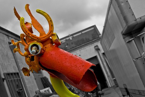
This guy was the star of the show so I wanted him to really stand out.

sparepart duckhead select by DiskoJoe, on Flickr

Me and the wife. The background was an awful blue color so i took that out.

joe and alesia by DiskoJoe, on Flickr

This one here has been pretty popular. People tell me it reminds them of Sin City. Fitting since its NOLA.


canal red - SIN city by DiskoJoe, on Flickr
 
I have no opinion on selective color, overall. I've never done it in a way that worked for me, so I basically avoid it. However, my issue with this particular one is that my eye is drawn to the blue lettering on the sign, rather than the guy on the bike. I prefer to be drawn *to* the subject, rather than *away*.

The first shot, I like. The second is definitely very saturated, but might be nice, if you tone it down a bit.
 

Most reactions

Back
Top