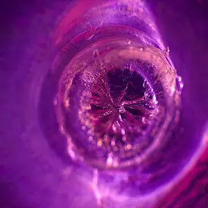
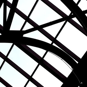
I like the original edit better, and it's better in b&w.
It's an abstract, and colors ties it too closely to the real thing for my taste. It could be more heavily processed, too, higher contrast or whatever. Whatever it needs to pull it away from the underlying reality.
To my taste, the image is actually the openings in the structure, and the bricks is the actual negative space. So, it's about placing those open spaces. Coming in close and symmetrical in the second edit seems to me to remove some of visual tension from the original image. There might well be a better crop than the first one, but I think that something with relatively loose framing, and the apparent tilt, are both necessary to make the abstract work as a strong image.






![[No title]](/data/xfmg/thumbnail/42/42453-e95056d39ba6f0ce0e7a7fff81041853.jpg?1734176993)