Navigation
Install the app
How to install the app on iOS
Follow along with the video below to see how to install our site as a web app on your home screen.

Note: This feature currently requires accessing the site using the built-in Safari browser.
More options
You are using an out of date browser. It may not display this or other websites correctly.
You should upgrade or use an alternative browser.
You should upgrade or use an alternative browser.
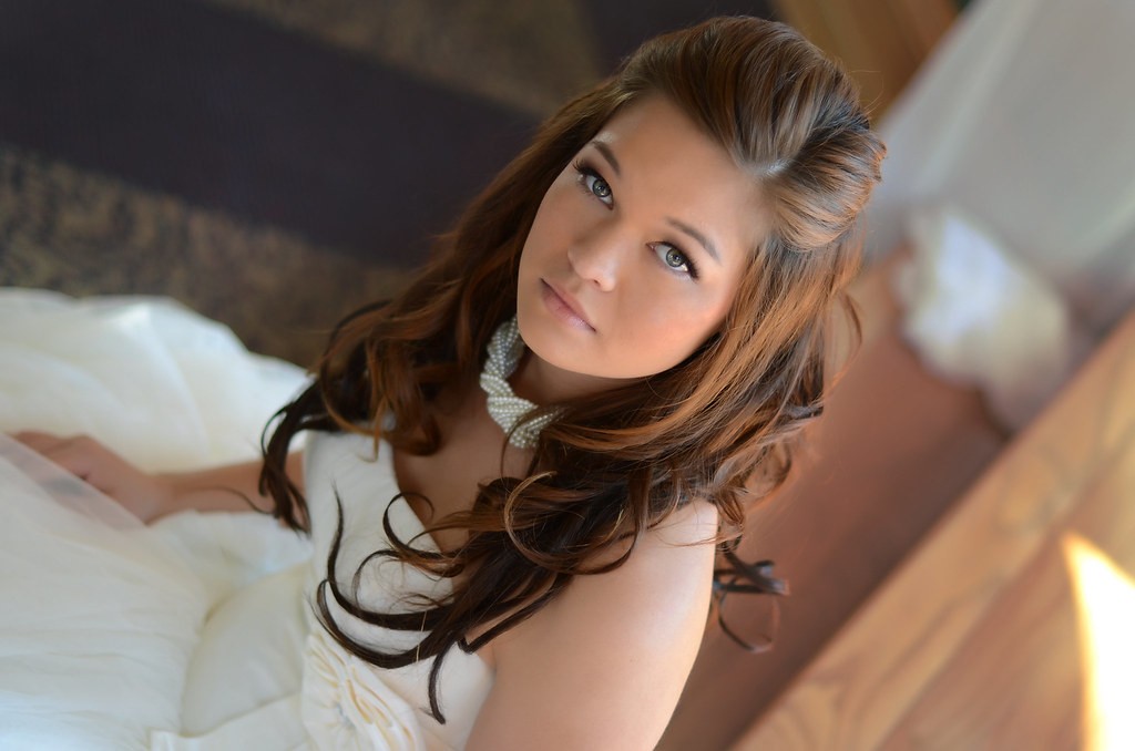
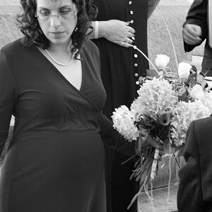
Bridal Session
- Thread starter Reyna
- Start date


Trever1t
Been spending a lot of time on here!
- Joined
- Dec 30, 2010
- Messages
- 9,331
- Reaction score
- 2,722
- Location
- San Jose, CA
- Website
- wsgphotography.com
- Can others edit my Photos
- Photos NOT OK to edit
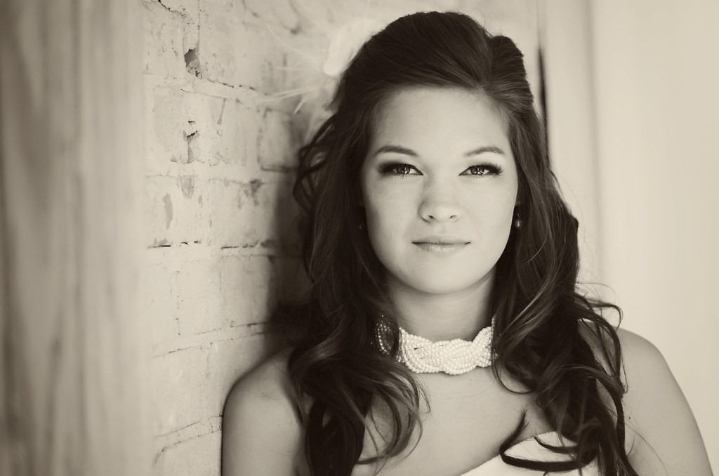
#5 is the money maker. The others suffer from minor crop and lighting issues, most of which can be improved in post.
rexbobcat
Been spending a lot of time on here!
- Joined
- Nov 28, 2011
- Messages
- 5,014
- Reaction score
- 1,967
- Location
- United States
- Can others edit my Photos
- Photos OK to edit
Nice. Good lighting and pretty bride. I do agree that some of the compositions are a little off but overall I think they're pretty good.
I do have to say, though, that with number 3 I think you should placed her hand in front somewhere. Because of the angle she's at and her long hair it makes it seem like a disembodied hand is grabbing her from behind. I think that maybe that's just an awkward pose in general.
I do have to say, though, that with number 3 I think you should placed her hand in front somewhere. Because of the angle she's at and her long hair it makes it seem like a disembodied hand is grabbing her from behind. I think that maybe that's just an awkward pose in general.
NorrellPhotography
TPF Noob!
- Joined
- Mar 13, 2011
- Messages
- 37
- Reaction score
- 2
- Location
- Idaho Falls, Idaho
- Website
- www.norrellphotography.com
- Can others edit my Photos
- Photos OK to edit
I like them. I agree with the above comment about some cropping and lighting issues. For example on the first pic, a little too much space on the left side is used for that wood when I would have preferred to have the edge of her left arm not cropped off. As for lighting, it's a bit flat and even. I think the overall appeal would be enhanced if it was more offset and directional. Very pretty overall and good skin tones.
- Joined
- Aug 27, 2012
- Messages
- 2,289
- Reaction score
- 661
- Location
- Orlando, FL
- Can others edit my Photos
- Photos OK to edit
Wow, these came out really nice IMO. She looks like Mandy Moore in a couple of these. Very pretty.
For those of you who dont know who that is.... http://i105.photobucket.com/albums/m203/tigerhun219/MM1.jpg
and... http://i105.photobucket.com/albums/m203/tigerhun219/MM2.jpg
That is besides the point I guess. The pictures all have a really nice look to them.
Dont worry, when you show these to the Bride, she wont say that you have lighting issues. She will say "Thank you so much"!
Reyna
TPF Noob!
- Joined
- Jun 18, 2009
- Messages
- 321
- Reaction score
- 8
- Location
- Texas
- Can others edit my Photos
- Photos OK to edit
Nice. Good lighting and pretty bride. I do agree that some of the compositions are a little off but overall I think they're pretty good.
I do have to say, though, that with number 3 I think you should placed her hand in front somewhere. Because of the angle she's at and her long hair it makes it seem like a disembodied hand is grabbing her from behind. I think that maybe that's just an awkward pose in general.
Thank you, rexbobcat! I did get quite a few with that pose but her right hand on her hip. Maybe I should have posted that one but I didn't want to overload on the images. I liked her hand like that though! She said she wanted her arms to look really skinny so I thought that would be a good pose for that.
jowensphoto
Been spending a lot of time on here!
- Joined
- Feb 28, 2011
- Messages
- 2,981
- Reaction score
- 899
- Location
- Northern Viriginia, US
- Can others edit my Photos
- Photos NOT OK to edit
I'm a sucker for sepia (when done well, at least) so #2 takes the cake for me.
ETA: it does appear a little on the green side for me, could just be this craptastic monitor I'm viewing it on though")
ETA: it does appear a little on the green side for me, could just be this craptastic monitor I'm viewing it on though
Reyna
TPF Noob!
- Joined
- Jun 18, 2009
- Messages
- 321
- Reaction score
- 8
- Location
- Texas
- Can others edit my Photos
- Photos OK to edit
I like them. I agree with the above comment about some cropping and lighting issues. For example on the first pic, a little too much space on the left side is used for that wood when I would have preferred to have the edge of her left arm not cropped off. As for lighting, it's a bit flat and even. I think the overall appeal would be enhanced if it was more offset and directional. Very pretty overall and good skin tones.
Thanks! Ok, so on image 1 and 2 that's an easy fix. I will do that. I can add pop to all the images but I'm so afraid adding too much, kwim. I tend to do that. I actually have 2 edited images of a lot of them with a lot more pop.....
Reyna
TPF Noob!
- Joined
- Jun 18, 2009
- Messages
- 321
- Reaction score
- 8
- Location
- Texas
- Can others edit my Photos
- Photos OK to edit
I'm a sucker for sepia (when done well, at least) so #2 takes the cake for me.
ETA: it does appear a little on the green side for me, could just be this craptastic monitor I'm viewing it on though
I like that one too. I'm calibrated and it doesn't look green to me so I hope it's your monitor! If not, someone please let me know! I have others with the same color and I don't want them looking green. Ugh.
Reyna
TPF Noob!
- Joined
- Jun 18, 2009
- Messages
- 321
- Reaction score
- 8
- Location
- Texas
- Can others edit my Photos
- Photos OK to edit
Wow, these came out really nice IMO. She looks like Mandy Moore in a couple of these. Very pretty.
For those of you who dont know who that is.... http://i105.photobucket.com/albums/m203/tigerhun219/MM1.jpg
and... http://i105.photobucket.com/albums/m203/tigerhun219/MM2.jpg
That is besides the point I guess. The pictures all have a really nice look to them.
Dont worry, when you show these to the Bride, she wont say that you have lighting issues. She will say "Thank you so much"!
You're totally right. She does look like Mandy Moore! She is beautiful.
I HATE to post and run but my mommy duties are calling me. I will check back later but thank you all for the good cc.
mommyof4qteez
TPF Noob!
- Joined
- Jul 25, 2012
- Messages
- 178
- Reaction score
- 9
Reyna said:I like that one too. I'm calibrated and it doesn't look green to me so I hope it's your monitor! If not, someone please let me know! I have others with the same color and I don't want them looking green. Ugh.
It does not look green to me...must just be his craptastic monitor... these photos look great!
Derrel
Mr. Rain Cloud
- Joined
- Jul 23, 2009
- Messages
- 48,225
- Reaction score
- 18,941
- Location
- USA
- Website
- www.pbase.com
- Can others edit my Photos
- Photos OK to edit
Massively Mandy Moore doppelganger!
Karloz
TPF Noob!
- Joined
- Jun 25, 2012
- Messages
- 36
- Reaction score
- 1
- Location
- Wellington
- Website
- www.carlleaphotography.co.nz
- Can others edit my Photos
- Photos OK to edit
Good work - only thing is the photos with the blue chairs in them - the chair distract me - does not add to the image.
Most reactions
-
 459
459 -
 324
324 -
 319
319 -
 298
298 -
 297
297 -
 236
236 -
 213
213 -
 192
192 -
 176
176 -
 164
164 -
 146
146 -
 142
142 -
 139
139 -
 121
121 -
 118
118
Similar threads
- Replies
- 5
- Views
- 458
- Replies
- 6
- Views
- 424
- Replies
- 8
- Views
- 469

![[No title]](/data/xfmg/thumbnail/30/30883-04222f7ae234efdf80dff6f96ddad16f.jpg?1619734495)
![[No title]](/data/xfmg/thumbnail/30/30885-2764c7a15a288ed06f3903d3a2756832.jpg?1619734497)