Bridge over high water (partially for abraxas)

Senor Hound

TPF Noob!
Joined
Apr 23, 2008
Messages
1,425
Reaction score
0
Location
La la land...
Can others edit my Photos
Photos OK to edit
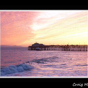
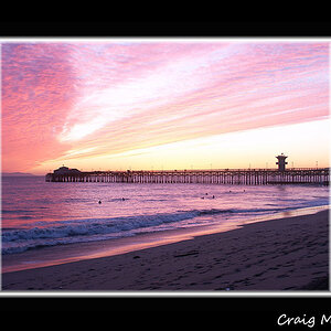
Any tips on composition is appreciated. For some reason the photo lacks contrast. I tried different stuff in Photoshop, but nothing was working. Someone told me that point and shoots really fall back on color variation, but I'm sure the person behind the camera (moi) has more to do with it than the equipment.

2586043531_6171d69048_o.jpg
 
I've always struggled with contrast too when converting to B&W/Monochrome.

On one hand, I don't think B&W looks very good without contrast, but on the other - I'm always afraid I'm over doing it.

As far as composition goes, I don't know how much help I can be. The bridge looks pretty interesting, I'd like to see more of it.
 
I don't think its entirely the fault of either you or the camera that is making this lack in contrast. The scene itself doesn't have much contrast to begin with. It looks like the grass, water, and sky are all on a very similar tonal range which makes bringing out contrast hard. I may be wrong and I'm sure someone will point it out if I am.
Sometimes just going back at a different time of day can make a huge difference.
 
I too would try to get more of the bridge. Lots of shadows and highlights on the bridge itself. Could make for a more pleasing photo.

Derrick
 
yeah, B&W can be tricky when your working in PP contrast or mid tones.It just takes a lot of practice, i'm still not all that great with it. If your using film like Kodak Tri-X or T-Max its naturally contrasty, but the late warm light of the afternoon works the best I think. Large format cameras are the best i hear for B&W as they have the most depth. I learned 35 mm is shallow in comparison. I'm not sure how digital compares to large format though in B&W.
 
I would have to say that is textbook composition, whether by accident or design, you've nailed it. The angled shoreline in the foreground takes you right to the bridge which in turn leads you to the far shore. Couldn't get better than that. The BW is nice as well. Ajay is correct, with the similar tonal ranges of all of the subjects, there's little you can do other than creating a number of different layers and selectively adjusting the contrast.
I would suggest removing the signs on the RH edge, middle, as their bright, white appearance is a little distracting.
All of that aside, what is the main subject of the image? I understand from the title what it should be, but the power-pole is such a small part of the overall image that it gets rather lost. I wonder if moving farther to the left along the shore so that the bridge was at more of an angle might not have shown the water level in relation to the bridge and shore to greater advantage?
Just my $00.02 worth - your milage may vary.
~John
 
SH, thanks for the thought. I'm hoping we got that straightened out.

I think the shot is lacking in a defined subject. Kind of like you may have been a bit shy about approaching that cool looking bridge and having your way with it. There's some great looking repetition going on in the truss spans. Relax and have some fun with the geometry. Try earlier or later in the day.

Best-

I have the photo of the bridge here, I had already posted it about six weeks ago (I think :) ). My consensus with that photo is I needed to get INSIDE the bridge and widen out the shot as much as possible to get it. But that was just my own observation.

http://farm3.static.flickr.com/2016/2435432569_2acd8749bd_o.jpg

My intention was to make the power line (or phone line, whatever it is) the focus, because its underwater and whatnot (the lake is REALLY high where I am). But I think by framing it with the bridge, I've thrown that off. The frame shouldn't be more interesting than the focus, I guess :)

I appreciate everyone's comments! Once again, I will keep shooting and from now on I won't be afraid of criticism. :) Now if I could only figure out contrast...

Actually the bridge it's self is not the issue, in my oppinion. This instance would have been a worth wile applicant for the rule of thirds. As it stands now the bridge makes the image leftside heavy.
 
Actually the bridge it's self is not the issue, in my oppinion. This instance would have been a worth wile applicant for the rule of thirds. As it stands now the bridge makes the image leftside heavy.

I'm sorry, but I'm not following how it made the image leftside heavy. Should I have taken this shot a little more to the right? Maybe include all of the opening of the bridge or something to that effect?
 
I'm sorry, but I'm not following how it made the image leftside heavy. Should I have taken this shot a little more to the right? Maybe include all of the opening of the bridge or something to that effect?

I ment right side heavy.....sorry bad day....but any who. Yes I would imagine that bringing all the bridge into frame would have helped considerably in this application, but that is just my oppinion with the given title.
 
I ment right side heavy.....sorry bad day....but any who. Yes I would imagine that bringing all the bridge into frame would have helped considerably in this application, but that is just my oppinion with the given title.

Thank you. This is actually a good thing cause it means I know enough about composition to catch your oops! :) I would almost guarantee this wouldn't have happened 4 weeks ago. You guys are rubbing off on me! :)

Thank you and everyone else who posted!
 
Thank you. This is actually a good thing cause it means I know enough about composition to catch your oops! :) I would almost guarantee this wouldn't have happened 4 weeks ago. You guys are rubbing off on me! :)

Thank you and everyone else who posted!

Oddly enough I cought the same woops earlier here.....but me head ain't screwed on straight tonight.
 
basically composition is good in my eyes (have to say that, since i posted a similar bridge shot on here already ;))


the only thing which bothers me is the empty foreground, lots of empty space which makes the bridge and the opposite shoreline seem unimportant. hence one might think there is no point of interest in this image.

Try making this a 2x1 shot cropping away the lower third of the image, and you will see a difference! maybe you will like it.
 
not perfect, but i had a quick go.

crop, push in contrast, reducing brightness a bit, reducing the noise in the sky a bit, slight re-sharpening.

houndbridge.jpg
 

Most reactions

New Topics

Back
Top