Bridge support

RockDawg

TPF Noob!
Joined
Mar 29, 2007
Messages
156
Reaction score
0
Location
NE Ohio
Can others edit my Photos
Photos OK to edit
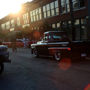
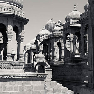
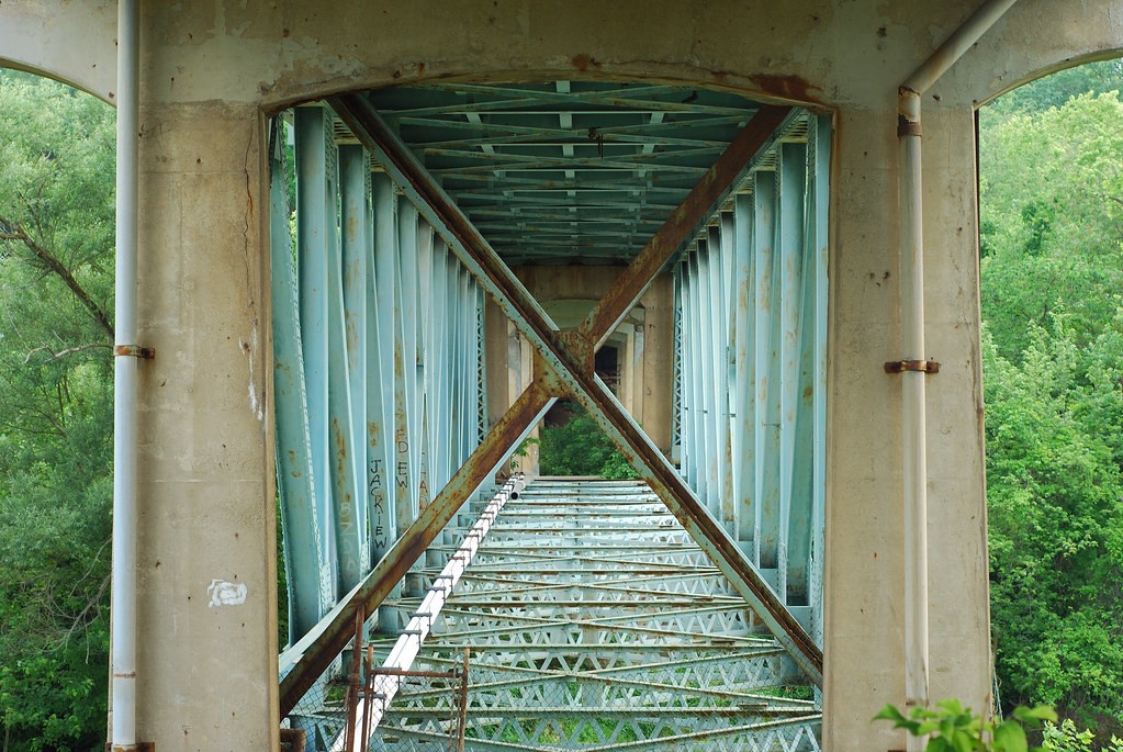
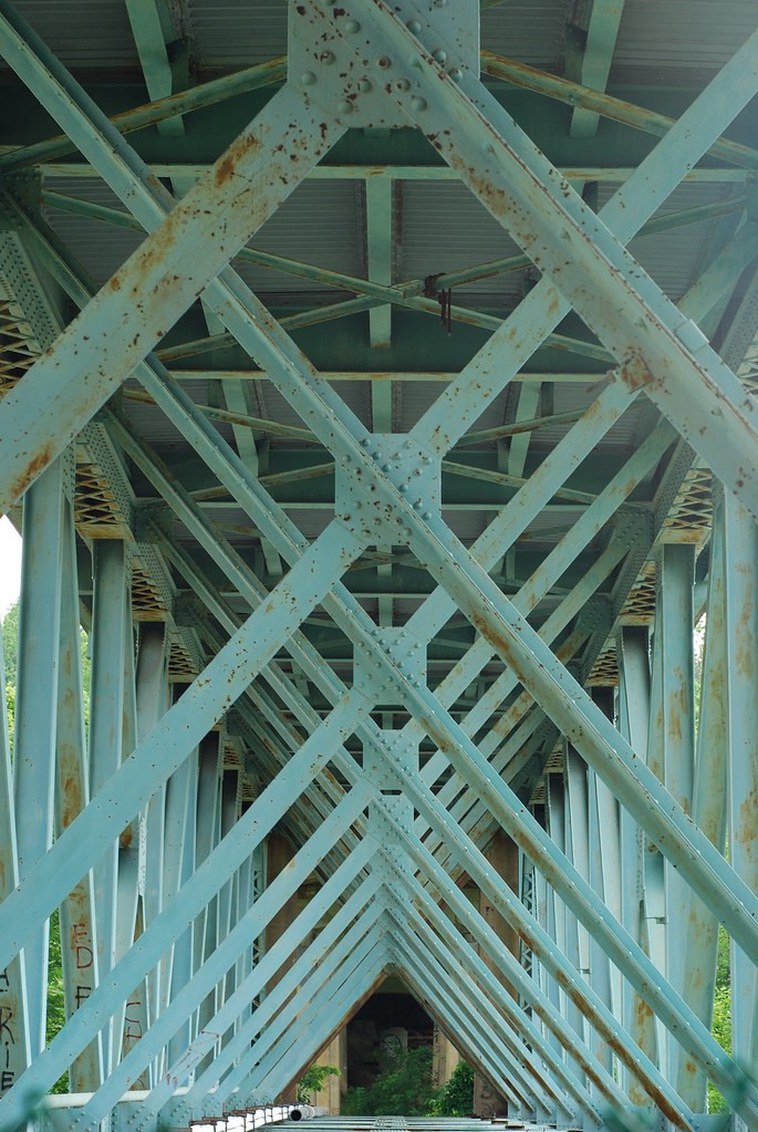
Here are a couple shots that I hoped would convey a sense of geometric symmetry alnogside everyday architecture . #1 also contains some landscape bordering the shot whereas #2 is strictly structural.

I'm looking for some C&C and please don't be afraid to be harsh. The more honest the better.

#1

2641339450_6bd7231f3a_b.jpg


#2

2641340904_fb9eb88fbc_b.jpg
 
C&C per req:
Of the two, I much prefer the second. In #1, the cross-brace seems to block my eye, and I find myself not getting much out of the image. I would suggest that #2 would benefit from a shallower DoF; that may or may not be possible but if it is, I think ideally, the first two supports in sharp focus, and the rest fading out as they recede. The concrete and greenery at the end don't really add much, nor does the brigh line lower left. I would suggest upping the saturation a tad as well. There's also an unfortunate flare in the UR corner.
I think #2 definitely achieves what you set out to do - a couple of suggestions for your consideration, but nice work nonetheless.
Just my $00.02 worth - your milage may vary.
~John
 
Thanks for the input. I also dislike the cross bar in #1, but I didn't feel it totally detroyed the image. I also thought the foliage on the sides added some nice color and texture to the shot.

I never considered a shallower DOF for #2. I automatically assumed all the braces should be in focus. I garee that the concrete and greenery at the end don't add anything, but I also don't feel they hurt it much either. I'd be curious what a consensus opinion on that would be. I totally missed the flair until shortly after I posted thsi thread. Don't know how I missed it. :confused: Does that look like the type of flare that a lens hood would have eliminated?

I'll try upping the saturation some. I'm really lost on where to begin with post processing so I usually post my photos without any and look for suggestions.
 
Last edited:
One bump for some more C&C.
 
I really enjoy shot 2. Good use of light and color and depth of field. You have to look at the image twice to really see what it is;)
 

Most reactions

New Topics

Back
Top