What's new

buildings?

john3eblover

TPF Noob!
Joined
Dec 19, 2004
Messages
257
Reaction score
0
didnt know what to title this one.

these aren't anything special, but they turned out allright, and i wanted to get some other opinions on them - how they look, if you like them, etc. thanks
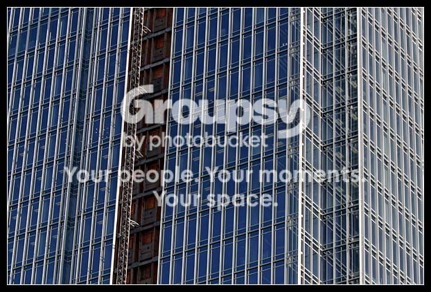
1180peachtreedetail.jpg


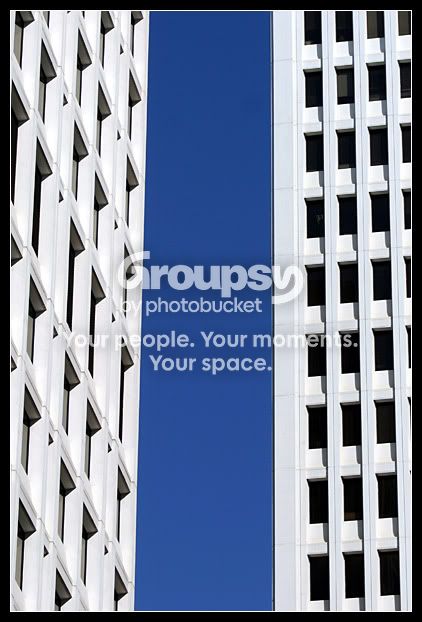
whitebluewhite.jpg
 
I definitely like the second one. The top one is a little busy for me, with the tiny windows and no real point of focus. The second one has a much stronger composition. You might have someone say the building on the right appears to be leaning, but this doesn't bother me. It makes a nice near-abstract, composition wise, and the strong blue and white is attractive. :thumbup:
 
I like the first one, but it is a little busy, and it doesn't really give anything to focus on (like terri said), but I still like it a lot for some reason.
 
I like the second one, the white, then blue, then white, one building on an angle, one head on...
 
The second one does it for me too, it's almost like the buildings are palying peek-a-boo :)
I would, however, do perspective correct (I know PS CS2 has it, but I don't know about any of the others)
 

Create an account or login to comment

You must be a member in order to leave a comment

Create account

Create an account on our community. It's easy!

Log in

Already have an account? Log in here.

Back
Top Bottom