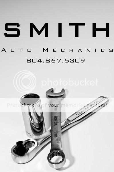
Its a nice look overall but:
1. I'd tighten the letter spacing on the "auto mechanics" line to get a line length matching "SMITH". If you don't, you need to show the proof to the printer BEFORE you show the client to see if the minimal margin is practical on their printing and cutting equipment.
(the following are a bity nit picky...)
2. I like the picture except the wrench in the center doesn't match the socket and socket wrench. The former is dirty and used and the latter two are very clean and shiny. The shot could work better either all grubby or all pristine.
3. The shadows are a bit harsh and crisp. A larger diffuser or softbox would have improved it. You can, if skilled enough, blur the shadow in Photoshop and achieve the decent softening.
")


![[No title]](/data/xfmg/thumbnail/35/35952-55c8d42ec1c6ff0e13b45356cbf9c068.jpg?1734167758)
![[No title]](/data/xfmg/thumbnail/35/35953-1a8b92df0115ff7026f31b78855ac815.jpg?1734167764)


![[No title]](/data/xfmg/thumbnail/42/42279-f60778d39180ee6cd87fc84a15559b96.jpg?1734176692)


