business cards

ryan7783

TPF Noob!
Joined
Apr 9, 2008
Messages
346
Reaction score
0
Location
Richmond, VA
Can others edit my Photos
Photos NOT OK to edit
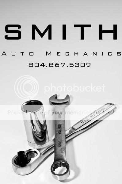
I'm working on some business cards for a friend and thought I'd throw out one of the examples I mocked up for him
smithautpmechanics.jpg
 
Its a nice look overall but:

1. I'd tighten the letter spacing on the "auto mechanics" line to get a line length matching "SMITH". If you don't, you need to show the proof to the printer BEFORE you show the client to see if the minimal margin is practical on their printing and cutting equipment.

(the following are a bity nit picky...)

2. I like the picture except the wrench in the center doesn't match the socket and socket wrench. The former is dirty and used and the latter two are very clean and shiny. The shot could work better either all grubby or all pristine.

3. The shadows are a bit harsh and crisp. A larger diffuser or softbox would have improved it. You can, if skilled enough, blur the shadow in Photoshop and achieve the decent softening.
 
I agree with Dwig that I think all of the wrenches should be the same, Grungy or Clean. But other than that I like it ;)
 
I wasn't setting up the shot for the final product. It was just a mock up so that I'd have something to show him. He hasn't approved the idea yet but if he does, I would make sure everything matched.

The shadows I'll work with later in the final shot
 
I like the overall idea. I agree that the wrench and the ratchet/socket should match but I do understand mockup.

Download a photoshop guide from where ever the card wil be printed because as it is layed out now, you will loose some of the text. You need to allow for trimming and bleed space.
 
I have made some business cards in InDesign and am pretty sure you are going to loose your lettering on the sides when it goes to print. So I would do as Dwig suggested and tighten up the lettering a bit so it doesn't get cut off.
 

Most reactions

Back
Top