KenL
TPF Noob!
- Joined
- Nov 1, 2009
- Messages
- 198
- Reaction score
- 0
- Can others edit my Photos
- Photos NOT OK to edit
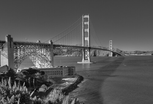
I recently had a shot of Mt. Shasta printed (actually a photographic process at Shutterfly.com) 30"x20". It came out perfectly, so I took it to a local frame shop. The shop owners (they have two stores, one here and the other in a neighboring city) looked at more of my photos online and said they wanted me to provide them with a number of my photos that they could display on a wall and in a flip-rack. I can set my own pricing, and can offer different sizes.
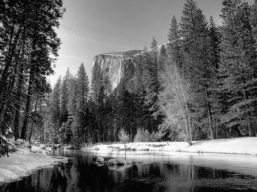
To start though, they wanted four in Black & White. Apparently, their experience is that many people prefer B&W becasue they are easier to fit in with their decor than trying to find the right colors! But, I don't do B&W......
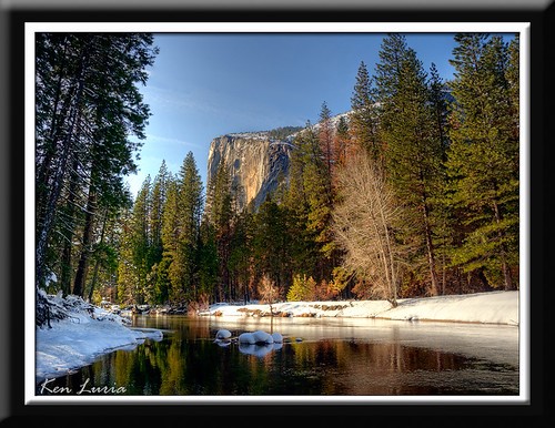
Well, I used to not do B&W.....I'm going to "cry all the way to the bank". So I chose four of my shots to convert, as a start. They also want full color, but my challenge was choosing some that I would convert. Here are the shots, with the color versions. I have the Epson R1800 which prints 13" sheet or roll paper. The store owner prefers that I use Epson Velvet Fine Art Paper, and that's just velvety-fine with me.
I spent a lot of time on each of the conversions. As some of you know, these small web versions just don't show the detail that a 13"x19" print can. The printed versions have tack-sharp detail.
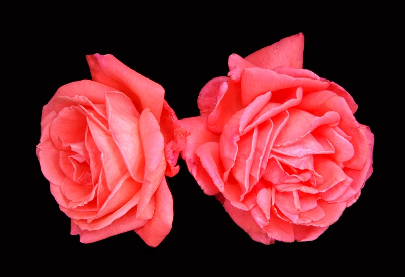
The last photo is not a B&W. It is of two roses that I had light-painted some time ago. Apparently they have been looking for a shot like this for a customer. The roses were in a vase with stems and leaves visible, but they wanted it without anything but the roses!
I keep telling myself, "The customer is always right", whether or not it is true.
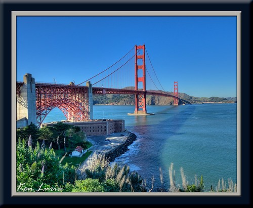
Golden Gate Bridge
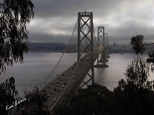
Oakland Bay Bridge

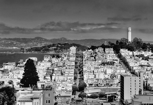
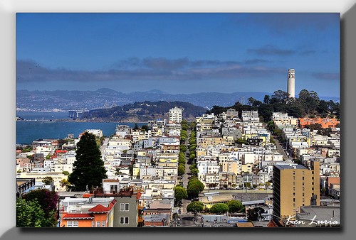
Coit Tower
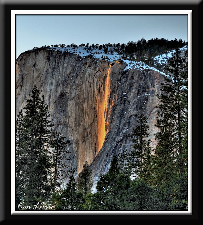
El Capitan (Yosemite)
To start though, they wanted four in Black & White. Apparently, their experience is that many people prefer B&W becasue they are easier to fit in with their decor than trying to find the right colors! But, I don't do B&W......
Well, I used to not do B&W.....I'm going to "cry all the way to the bank". So I chose four of my shots to convert, as a start. They also want full color, but my challenge was choosing some that I would convert. Here are the shots, with the color versions. I have the Epson R1800 which prints 13" sheet or roll paper. The store owner prefers that I use Epson Velvet Fine Art Paper, and that's just velvety-fine with me.
I spent a lot of time on each of the conversions. As some of you know, these small web versions just don't show the detail that a 13"x19" print can. The printed versions have tack-sharp detail.
The last photo is not a B&W. It is of two roses that I had light-painted some time ago. Apparently they have been looking for a shot like this for a customer. The roses were in a vase with stems and leaves visible, but they wanted it without anything but the roses!
I keep telling myself, "The customer is always right", whether or not it is true.
Golden Gate Bridge
Oakland Bay Bridge
Coit Tower
El Capitan (Yosemite)
")