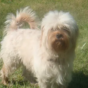
I so a ppreci be more shadowsate the feedback. It's sends me in a million more directions with questions and my interpretation. First off I must've had the uploaded image too long for the tractor pic.#4 His feet aren't cut off in mine. I think that not having the background blurred made the picture. I realize it's not a portrait. There are others from that shoot where he tipped his hat and the background is blurred. I just thought that picture had something the others didn't. I would love to know how to enhance to look more like a photograph instead of a snapshot. My editing skills are very minimal and as they progress is that something that is even possible?
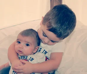
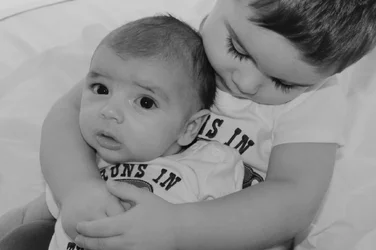
#3 is my most recent and I have learned that DoF is critical in portrait photography by trial and error. I liked him off center because the window in the top left corner balanced it. I vaguely remember noticing the eye in the background and disregarding it where I agree it is a complete distraction. Level adjustment is beyond my vocabulary right now. Is that the brightness, tint , color, etc"slider"?
#2 I felt since the focus was on the book cropping most of the baby didn't take away from it. That is a completely unedited photo and will go back to it one day with the effects you suggested.
#1
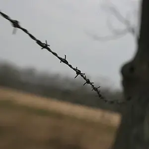
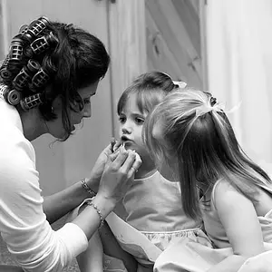
I felt it needed more background. Need explained how the flash ruined it. Her face washed out? Should there be more shadows? Are shadows always a bad thing? I don't think I fully understand highlights and shadows.
Yes four is too many at once. My oh my!

Your critique is so much appreciated. Thank you thank you








![[No title]](/data/xfmg/thumbnail/31/31707-a2840f3af9af3a4fa6f6dfbd4028eae5.jpg?1734160381)