C&C greatly appreciated on a few pics

Xavi

TPF Noob!
Joined
Jul 22, 2009
Messages
125
Reaction score
0
Location
Corona
Can others edit my Photos
Photos OK to edit
Hello everyone! My name is Javier but many of my friends prefer to call me Xavi for some reason. I've been lurking around the forum for a while now and have finally decided to post up a few pics. Nothing too exciting at the moment... more than anything I'm just trying to get a feel for my DSLR and learning how to compose and how to give my photos a nice touch through post processing. I've seen some absolutely amazing work while roaming through the forum these past months and only hope that with practice and persistence I can someday photograph the outside world with the same grace and beauty that has been displayed by some very talented photographers here. Here's a few I would appreciate C&C on. Be as honest and blunt as you'd like!
Thanks for your time!

All shot with Nikon D40x 18-135mm
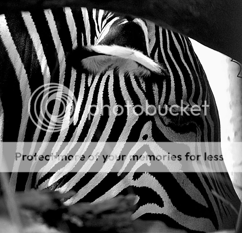
1.
Aperture Priority: [F/5.6, Exposure 1/125 sec, ISO 400]
I made this pic B&W because the original color photo had some distracting bright colors that didn't blend well with the zebras stripes so I just opted for a B&W to mask those colored specs in the original.

3.jpg


2.
Aperture Priority: [F/6.3, Exposure 1/100 sec, ISO 100]
With this sunset picture I really wanted to capture the red-orange glow of the sun and have it loom over the surface of the water. I like this image however I fear that I may have tweaked the saturation and contrast levels too much. let me know what you think.

12.jpg


3.
Aperture Priority: [F/8, Exposure 1/200 sec, ISO 100]
I shot this today with the hope of capturing a bird in flight. Instead I got this bird standing on one foot hopping branch to branch in the water. Not sure if my eyes are deceiving me or not, but in this one, I can't tell if the bird is properly focused and sharp. Looks a bit OOF to me.

DSC_0050.jpg


What do you guys think?
 
Welcome Javier, I'm new also and have lurked the forum for a couple of weeks now. I like your photos. #3 is my favorite. I like the position of the bird and how clear the water looks. I can't tell if the bird is focused or not either because part of it is dark due to the shadow. Keep it up. I'm a photography noob so that's my $.01 :lol:
 
Welcome!
Overall, 3 great pics both the shot and PP.
I think your choice of edit processes hit the mark on all three.
#1 zebra has a thoughtful pensive look, both the animal and the photo. At first I thought closer crop on the eye - but no, as it is would be nice in a simple frame and mat.
#2 I had a recent sunset all orange like yours - the AWB in camera was fooled and it did not work at all - I fixed it to show some colors and perfect, though yours works nicely, sharp silhouette, Excellent color gradations, interesting foreground - again a very framable pic!
#3 the sharpness gives it a smooth flow. While I think a bit more background may have improved the shot - bird is too centered - it works nicely from both the tech and the art POV.
Great work! Varied subjects with 'accurate' PP work appropriate to each, not mass produced chaff that's all too common.
 
Good call on going B&W on #1. I added a little unsharpening mask- seems to help the stark contrasts of the stripes

3s.jpg


#2, good shot, but I agree you went a little too far on the saturation.

#3, I'm not concerned about the focus on the bird. It's silhouetted well enough for that not to be a factor. I like this shot. Composition, the water, etc.
 
Much in agreement with Denny Crane, except felt there was nothing off on #2. #2 and #3 are a wonderful contrast to each other. #1 didn't look right, maybe because of the way the shot was framed. Contrast did help.
 
Welcome Javier, I'm new also and have lurked the forum for a couple of weeks now. I like your photos. #3 is my favorite. I like the position of the bird and how clear the water looks. I can't tell if the bird is focused or not either because part of it is dark due to the shadow. Keep it up. I'm a photography noob so that's my $.01 :lol:

Thanks for the words Layspeed!
 
Welcome!
Overall, 3 great pics both the shot and PP.
I think your choice of edit processes hit the mark on all three.
#1 zebra has a thoughtful pensive look, both the animal and the photo. At first I thought closer crop on the eye - but no, as it is would be nice in a simple frame and mat.
#2 I had a recent sunset all orange like yours - the AWB in camera was fooled and it did not work at all - I fixed it to show some colors and perfect, though yours works nicely, sharp silhouette, Excellent color gradations, interesting foreground - again a very framable pic!
#3 the sharpness gives it a smooth flow. While I think a bit more background may have improved the shot - bird is too centered - it works nicely from both the tech and the art POV.
Great work! Varied subjects with 'accurate' PP work appropriate to each, not mass produced chaff that's all too common.

Thank you for your time and critique! I love the way you described the zebra pic. Its spot on what I was trying to go for that day! I agree that the pic wiith the bird needed a background. The only thing that stopped me from composing a shot with a background was that the sun was in the direction I was shooting so I was simiply afraid of blowing out the sky. I wanted to make sure I avoided that and still captured the moment. Maybe I'll stop by later this week and try again. Thanks again!
 
Good call on going B&W on #1. I added a little unsharpening mask- seems to help the stark contrasts of the stripes

3s.jpg


#2, good shot, but I agree you went a little too far on the saturation.

#3, I'm not concerned about the focus on the bird. It's silhouetted well enough for that not to be a factor. I like this shot. Composition, the water, etc.

That looks great DennyCrane!! The stripes really pop and show some nice detail with the adjustment you made. Thanks for your time and critique

Much in agreement with Denny Crane, except felt there was nothing off on #2. #2 and #3 are a wonderful contrast to each other. #1 didn't look right, maybe because of the way the shot was framed. Contrast did help.

I agree, the shot was originally very tight and awkward. I took the image while the zebra was slowly strolling in front of two tree branches. I positioned my self as close to the branches as possible, zoomed in and just hoped for the best. Thanks for stopping by and taking a look RancerDS.

take care
 
like 2 and 3 the most. both are excellent. no 1 is nice and with a good mood, but the tight crop makes it a bit difficult to discern what is in there, and by the time I figure it out the "pop" effect is gone
 
like 2 and 3 the most. both are excellent. no 1 is nice and with a good mood, but the tight crop makes it a bit difficult to discern what is in there, and by the time I figure it out the "pop" effect is gone

Thanks for the comments rocdoc! It is indeed a tight crop. Next time I will make sure to avoid such a tight composition.

This forum community is great!! I'm definitely absorbing everything you guys are saying and will keep it in mind on my next outing. Thanks again everyone!!
 

Most reactions

New Topics

Back
Top