C&C... I think I can handle it....

hw13

TPF Noob!
Joined
Feb 18, 2012
Messages
20
Reaction score
6
Location
Toronto Ontario
Can others edit my Photos
Photos NOT OK to edit
I've avoided posting pics on forums for a long time as I didn't want to get discouraged if they got torn apart.
Now I'm getting much better at tearing them apart on my own.

Here are a few that I am really happy with. But I'd like to hear what you guys think.
So let me have it, I'll do my best not to cry. LOL.

#1

#2

#3
 
I am really liking #1, my only critique would be to get the entire plant in focus. But that is just personal preference :)
 
@paigew - That's the only thing that really bothers me about it too. It was really a fluke shot as it was. I'm doing the 365 project so lately I've just been going around taking pictures of EVERYTHING.

It was when I got home that I realized how much I really liked it. Then I wished I had taken more to try to get it all in focus.
 
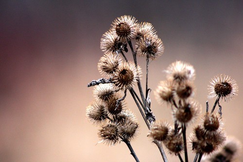
#1 is a good shot. I like the use of blank space and how well the subject is separated from the background. Also the bokeh is very smooth. I like that not all of the flowers? seed pods? are in focus it adds more depth to the image.
 
after looking at the EXIF....switch to shooting in RAW so you have the ability to edit. Also, careful shooting wide open as lenses are not that sharp wide open stop it down a little to increase the sharpness of your images. Still nice shot!
 
I agree the first is the best of the lot, but I think the whole lower right quadrant is distracting, focused or not, and the center is the interesting part. You could crop or if possible re-shoot and move around to the left to isolate the part in the center.
 
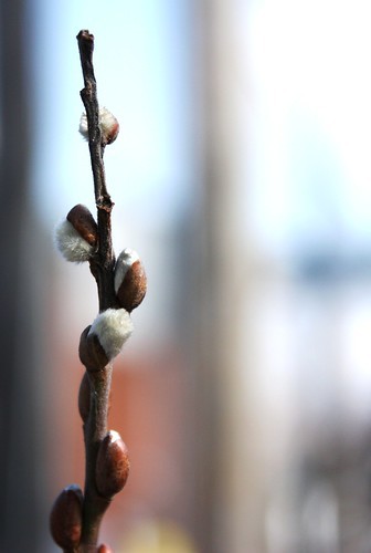
Number one is gorgeous. Love that nice creamy background! The second could have been equally as great, but the BG is a little distracting. The third has nice colors and saturation, but I think a different angle/POV could really make it pop.
 
I am really liking #1, my only critique would be to get the entire plant in focus. But that is just personal preference :)

Same! Even with the out of focus areas I wouldn't throw it in the trash or anything. Keep shooting, don't be afraid to post :)
 
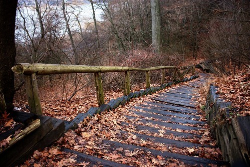
I think #3 is attractive in addition to #1. However, #3 has some weaker areas that I would change. The first is the upper left where you can see the bright area. The draw of the image is the strong pattern of the steps broken up by the random but colorful leaf pattern. The bright blue area in the top left doesn't fit into this image for me. Also, the dark tree trunk (I think) on the left doesn't have anything to balance it out with and it also seems out of place.

I would consider a wide and tight crop... I feel like this is more effective. Pardon the sloppy quick healing job.... it's just to give you an idea how it can help open up the image a bit.

6923708129_d0c0e4f8a7_b.jpg
 
Why desperation, i can't see.... these are beautiful images with possible alterations( but that is valid for any image)
#1: Lovely image; i would recommend a vertical shot with more of stem seen... but that would be at the cost of missing the empty positive space on the left, because this space has something to do in this image..... so only as a variation i would recommend a vertical one
#2: The beautiful colors of the B/G dominats... and i am afraid the stem is not sufficiently focused... or is that my eyes???
#3: Lovely place... the prime focus must be there where the eyes are directed to.... where was your focus in this image? Not sure, if you had moved a bit to left and shot a better angle would have resulted ???? that was a matter of experimentation only

Regards :D

I am really interested to see more of your works :D
 
Wow, you guys are being a lot nicer than I expected. LOL. And I do agree with most of what you're saying.

#1 was actually a large bush of burrs. The part that is blurry is the part of the plant that was closer. I don't think I would have been able to get more stems with a vertical shot. Also, I cropped out some other crap that was on the left/bottom area.

In #3, the bright area in the top left is a pond. Originally I was going to walk down to the pond to take pics but it was cold and kinda rainy. This pic was taken because when I saw the stairs, I decided I didn't want to walk back up. I wanted the pond to show. Hope the story better explains the shot.
 
I like #3. Why ? don't know, just really like it.
 

Most reactions

Back
Top