What's new

C&C my street shooting please

The second one first.

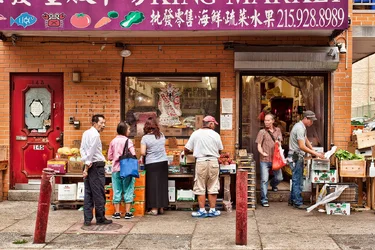
I would remove the perspective distortion so that the walls indeed are parallel to the edges.
And remove the noise
Since the real centers of interest are the people I would crop the text in English that draw viewers' eyes but leave enough Chinese text to provide some hint of the environment.
$step01.webp

It is quite saturated and contrasty so I would lower the saturation/contrast overall
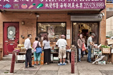
$step03.webp

the reds still draw attention so I would lower them separately
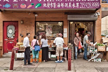
$step02.webp

this is still so busy that my eyes go everywhere so I would convert this to BW (now that contrast allows) so that the people are easier to pick out of the entire scene.

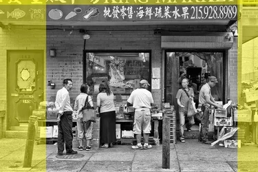
dL8dRn.jpg
 
Nice B&W, I'd crop it tighter both sides though. Eddie, is this ok to edit?
 
Thanks, Lew. Interesting. Ristretto, normally no, but Lew asked and this is an area of photography not in my comfort zone so yes, have at it. gsgary the Brit, that Alex Webb is quite amazing.
 
$dL8dRn.webp I see it more like this. But the phone number is so prominent - I think i'd clone it out. I know that's not a 'documentary' thing to do, but I'd do that here.
 
Interesting, gentlemen, all of the edits. I'll never be a documentary guy. I think reality is overrated. In your edit ristretto, I'd have to exit remaining pole. Thanks.
 
Here's what they're not telling you. You might read this in a round-a-bout way in a book, but none of them (at least that I've ever read) have come right out and said the plain, simple truth:

You need a big pair of brass balls for street photography.

I'm not sure what you're shooting with, but you are definitely not close enough. If you're not up close and personal, don't take the shot. We want to feel like we're there. We need to see what you're seeing, and you shouldn't have to explain it to us. We want to see stories. I want to see in that man's face WHY he is sleeping on a park bench in the middle of the day. I want to feel his pain. With street photography, you can't just randomly shoot things that catch your eye...because that's exactly what your viewers see. Random stuff that has no meaning.

Look at the work of Boogie and Vivian Maier. Contrast that with what you have here. Street photography is about 90% personality and 10% composition.
 
I disagree that you have to be brazen and in someone's face to get good street shots. Some scenes require more context to convey a meaning. Some moments are farther away - that doesn't mean you can't take the shot just because it's across the street. You can take photos without being intrusive, you just have to pay attention to everything. I mean everything. And you have to be ready to take the shot because it's often gone in a split second. For me, street photography comes down to two things: noticing and timing.
 
I didn't mean that you have to be in someone's face a la Bruce Gilden. Just that you have to get in there and be able to mix it up elbow to elbow. It's all subjective, of course...but to me, that's the difference between "meh" street photography and good street photography: distance. I agree that some scenes are contextual, but there are a lot of street togs who just take photos of people looking at fruit at the market or crossing the street. Be close enough that they make eye contact with you, and 9 times out of 10, it will be a better photo.


$Street-1.webp
 
Well yes, I agree that if the faces are an essential part of the "story" or message or meaning, then you've got to get close enough to see that. And it does require that the photographer become bolder than they might otherwise be. I know this is something that I struggle with, but it gets easier with time and practice.

I think one difficulty when someone is trying to do some street shooting is that it can be a lot of different things. Sometimes it's not necessarily about the person, but rather about the spatial relationship between the people that makes the image interesting. Or it can be a juxtaposition of colors or shapes, for example, that people have created with their presence. A couple of photos from another forum I'm on come to mind:

the 35mm PHOTO bureau: Shot of the Week #172
the 35mm PHOTO bureau: Shot of the Week #141
the 35mm PHOTO bureau: Shot of the Week #148

It takes a long time to be able to recognize moments that actually translate to other people. Sometimes you see something and you take a shot but when you look at the result, you realize maybe you took it a second too late or too early, or that the camera just didn't 'translate' what you saw into the image. It takes a lot of practice to tell the difference between a shot of someone just walking down the road and a shot of something interesting happening.

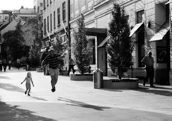
It also helps to be able to predict people's behaviors, which gets easier the more attention you pay to them. Here's one of mine that worked out because I noticed how the two were playing, I predicted what would happen next, and was ready to get the shot with the proper timing:

$Jumping.webp
 
I think the choice of crop leads to an interesting (at least to me) discussion.
There are probably an infinite number of decent crops for any picture and which one is the 'best' is discussable.
I think that every crop, particularly on a busy image, is an attempt to balance the contents of the picture with viewers' tendencies to assign weight to items depending on their position in the picture.
Inevitably things at the thirds seem more prominent and important and things at the very edge seem less important (except in specific instances not being discussed)
Readable text draws attention, as does bright tones and things like doors and windows that have an implication of motion.

So cropping off the edges to remove the door and the street opening tightens up the picture but also crowds important items to the edge and means that the third on the left is essentially unoccupied.
The one on the right brings attention to the interaction between the two men nicely but then that single post in the center becomes an issue.
9zrxzP.jpg


The original crop was chosen to keep the people (important) off the edges and put them, as much as possible, in important spots. That meant keeping the door and the edge of teh building as a tradeoff.
Which crop chosen is by taste but there are good arguments and good reasons for both.
Perhaps my point is that design (in this instance, the crop) should be the product of decisions not just arbitrary.
THe editor must take into account how people see and parse pictures and then make a choice how to present the picture to the viewer.

lFjKE7.jpg
 
Last edited:
So cropping off the edges to remove the door and the street opening tightens up the picture but also crowds important items to the edge and means that the third on the left are essentially unoccupied.


The 'third on the left' in my crop contains three people. In yours it contains two people.

The crop could be looser on the right, but not so much of the left: the guy far left should anchor the left side, not the pole.

"Perhaps my point is that design (in this instance, the crop) should be the product of decisions not just arbitrary."

The inclusion of the obliquely-leaning pole, looks ugly and distracts. The door is an ok element but the pole compromises it too much.
 
The 'third on the left' in my crop contains three people. In yours it contains two people.

I'm not getting into an argument about whose crop is better, I posted to explain my decision process.

But you do misunderstand the meaning of 'thirds'.
 
Last edited:
I agree with Lew for two reasons.

1. He is right.

2. He bought me lunch.
 
Also gonna agree with Lew. And he didn't even buy me lunch. :grumpy:
 

Create an account or login to comment

You must be a member in order to leave a comment

Create account

Create an account on our community. It's easy!

Log in

Already have an account? Log in here.

Back
Top Bottom