What's new

C/C Needed on some photos

TheWoz

TPF Noob!
Joined
Jan 5, 2013
Messages
19
Reaction score
2
Can others edit my Photos
Photos OK to edit
Ok,

We'll I have been working a little harder at getting some better quality photo's in. So on my honeymoon I had a lot of time to play around.

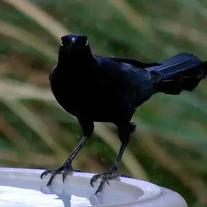
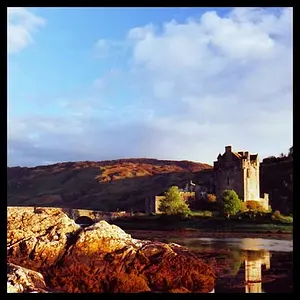
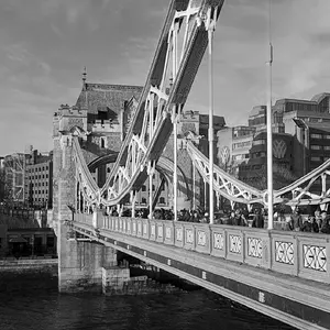
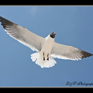
I'd like to hear some constructive criticism on what I would say are some of my improved upon photo's. (Don't worry I have thick skin) :sexywink: I'd just like to get better at this jazz!

Thanks all! I appreciate it.

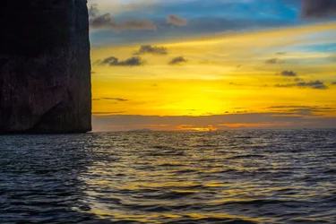
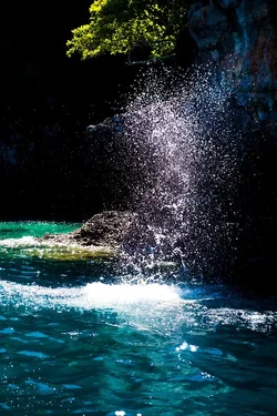
#1. $1383798_593300344061265_1750598186_n.webp
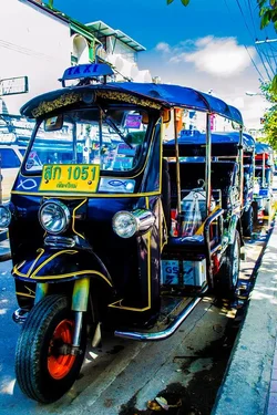
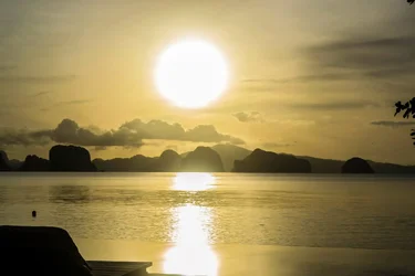
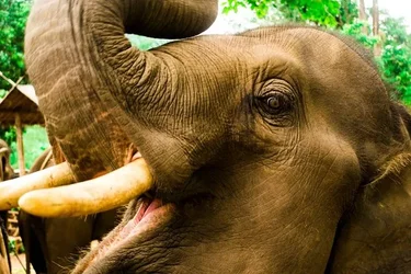
#2$1074393_604114692979830_1642538331_o.webp
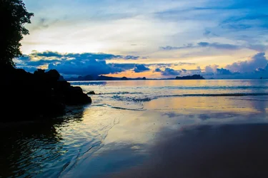
#3$615015_594602170597749_1028984106_o.webp

#4$964926_594600090597957_220273656_o.webp
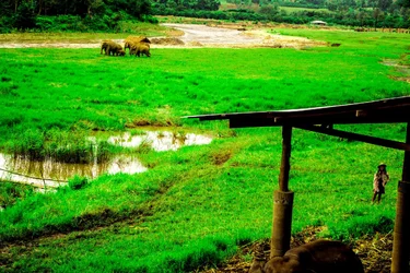
#5$1040758_592503737474259_1224683450_o.webp
#6$1385029_594615190596447_279561969_n.webp
#7$1392010_592510264140273_860445873_n.webp
#8$1398528_603590689698897_20444559_o.webp
#9$1398614_604114506313182_1723982630_o.webp
#10$1400526_594596550598311_1516981317_o.webp
 
Last edited:
Hey Woz. It helps to number them and keep it to 3-5 for C&C.

It takes time to do a quality critique of all images.

The two on here that jump out at me and why are these.

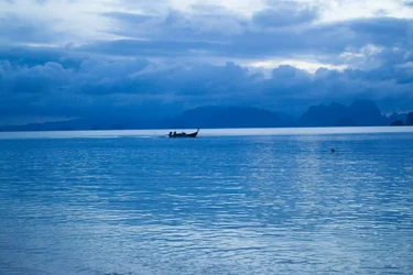
#8 I love the bluegreen of the water. I think this is the best one.

#5 with the green grass. This one looks way oversaturated to me.

#4 isn't bad either.
 
#2 I like best. The only critique I would make is shutter speed looked a little slow. The ripples in the water look blurry.

#6 is interesting, and again, still not quite sharp enough for my taste.

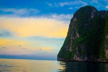
#9's horizon line is crooked. Would probably be much more pleasing if it was level.

Color saturation seems really intense on several. I would consider backing that down in post.
 
all a bit over-saturated to me.
 
over saturated to me. #1 is ok to be over-saturated, gives a sensation.
My Fav is No.2.
 
2, 4, 5, 6, 8, 9, & 10 - All of these look crooked to me. Watch your horizon!
Looking again, #3 looks a smidge off of horizontal as well. (Sorry, horizons are my pet peeve)

Otherwise, I think you have good exposure on these, and very interesting subject matters! They are fairly well composed as well. Keep snapping!!
 
Overall they are nice, the only two suggestions I'd give you is:

- tone down the saturation/processing just a touch, and
- watch that your horizon is level
 
Thanks guys! Yea I might have gotten a little carried away with the post. Just got a Mac and was having some fun. I'm having a hard time finding the balance when shooting raw (which is new to me).

Some of those shots were from "the beach" the place the movie was filmed on. And the photos came out very dull compared to what it really looked like. And suggestions on how to get a more "true" color and not so much saturation?
 
We'll I have been working a little harder at getting some better quality photo's in. So on my honeymoon I had a lot of time to play around.
I was going to comment on your posted words but decided I should stick to the photos. :)

I prefer a little less saturation. Try using the vibrance slider instead of the saturation slider. Here's an explanation. Vibrance vs. Saturation in Plain English - Digital Photography School

1,6 and 7 could use a little more breathing room. The subjects seem a little squished in there. I pretty much agree with the other comments as well. Nice shots. Hope you had a great honeymoon. Good luck in your marriage.
 

Create an account or login to comment

You must be a member in order to leave a comment

Create account

Create an account on our community. It's easy!

Log in

Already have an account? Log in here.

New Topics

Back
Top Bottom