
mbbye
TPF Noob!
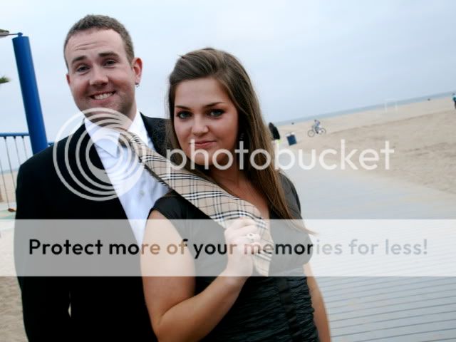
Hi, I've been playing around with Photoshop a bit lately and was hoping I could get some comments/critiques on this photo from my fraternity formal. I know the removal of the background items isn't perfect, but for not knowing exactly the best way to tackle this (I used the clone stamp), I'm pretty happy with the results. Also, I thought the added filter/color tweaks gave the photo more of a kind of classy look. What do you all think? Thanks!
*Lastly, just to clarify, this picture was taken by a friend of mine (i'm the guy in the picture). My friend isn't a photographer so hence that is why there is the tilted horizon and it's a bit soft. I thought it was a funny enough picture that it was still a keeper though. With that said, I'm more interested in pp comments then critiques on the photographic skill.
original:
edit:

2nd Attempt:
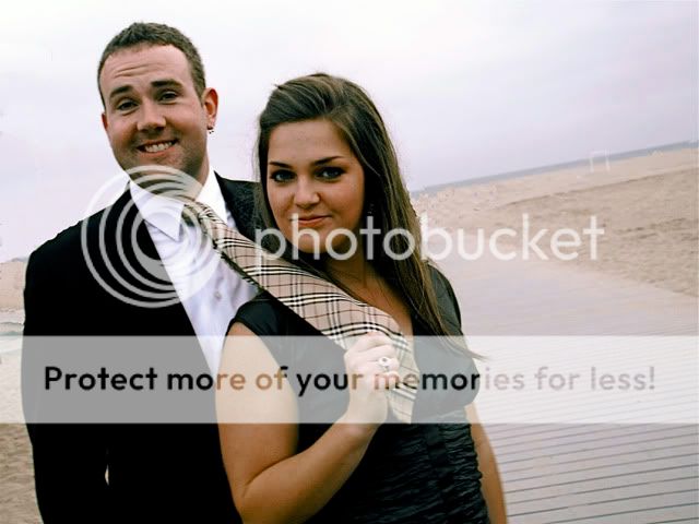
*Lastly, just to clarify, this picture was taken by a friend of mine (i'm the guy in the picture). My friend isn't a photographer so hence that is why there is the tilted horizon and it's a bit soft. I thought it was a funny enough picture that it was still a keeper though. With that said, I'm more interested in pp comments then critiques on the photographic skill.
original:
edit:
2nd Attempt:
Last edited:


![[No title]](/data/xfmg/thumbnail/32/32635-be18e952e67667cbb1525b4b057b6423.jpg?1619735554)

![[No title]](/data/xfmg/thumbnail/34/34483-f862f99992bbdd79e95d390a65e59f6e.jpg?1619736510)
![[No title]](/data/xfmg/thumbnail/35/35597-714b74cc48992e5353856abfe325df68.jpg?1619737065)