What's new

C&C playing with new lighting

joylyn

TPF Noob!
Joined
Jan 1, 2013
Messages
94
Reaction score
17
Location
United States
Can others edit my Photos
Photos OK to edit
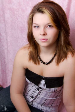
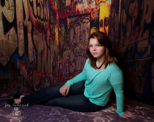
Finally purchased a flashpoint studio flash with umbrella and I finally had the chance to play around with it abit yesterday. I used my 18-200 , ISO 200, 7.1 , 1/160. Im pleased with the end results but feel like there is something missing .
1. $IMG_0048fb.webp


2.$IMG_0002-2fb.webp
 
NOT too bad for early efforts, Joy! I'm not exactly sure what you mean by 'something missing'. The way these are lighted is fairly straightforward. I see a lot of noise reduction has been applied, or perhaps clarity has been reduced in post; the skin looks very smoothed, and detail is somewhat low when the images are viewed full-sized. In shot #1, I think the umbrella might be a bit too much "straight on", which has caused it to light her entire face pretty much equally, with not a lot of shaping from shadows. The lighting is somewhat "broad lighting", which comes in and rakes across the face in the broader orientation of the face to the camera. That makes her face look a bit wider than it might really look in reality.

The second shot shows some of the edges of the umbrella's beam; notice how here knees to her feet are much more dimly-lighted? In this case I think that works, to sublimate everything except her face and torso. Umbrellas typically put out a brighter center spot, with lower-brightness edges. The umbrella can be aimed full-force,and directly AT THE FACE, as in shot #1, where pretty much everything in the frame is of equal brightness, or close to it. In shot #1, her face and the pink background are pretty close in brightness. In shot #2, which is a wider-angle view, we can see the softer, dimmer edges of the umbrella's beam, and we can see where the light becomes brighter.

Not sure, as I said, what you think 'is missing', but it might just be more experimentation and practice; these are far from awful. You'll probably find that as you use the umbrella more, you'll start to get a feel for how it throws its light. You might try aiming it so that the softer, edges of the beam light the face, and the hot-spot misses the subject. You can also try lighting the subject from the opposite direction,relative to the way the subject's face is oriented to the camera. Again though, these are pretty good for early efforts! Don't be too hard on yourself.

 
Perhaps by something missing, Im not digging the way the shoulder is clipped in the 1st shot, lets me wander out of frame. I like the lighting and beautiful model!
 
What did you finally end up getting, Joylyn?
 
Thanks Derrel for your reply. I guess im still abit nervous about the lighting setup and very unsure of myself at this stage. I will be practicing more and more .1st photo I shot Miranda (my daughter) with the strobe straight on and my camera was actually right under the light. 2nd photo was actually at an angle with me also at an angle wanted to give it depth.
ty spacefuzz my daughter is quite the model lol thank goodness she let me talk her into this :) She gets tired of me taking her picture .
Cgipson I purchased these as well as a reflector holder, a flash diffuser. I am hoping to get more lights in the near future.
Flashpoint II 320M, 150 Watt Second AC / DC Monolight Strobe.
Fotodiox Pro 16-rib, 60" Black and Silver Reflective Parabolic Umbrella with Neutral White Diffusion Cover

Thanks again :) take care
 
Not bad. In the first image she's too close to the bg. The bg should not be that sharp. It should enhance the subject, not become part of her. In #2, the fingers should be spread a bit more, and have the right hand stretch down the leg and the fingers flow toward the foot, creating more of a triangle, elongating those legs. When the elbow is against the waist line, it becomes part of the waist. You want space so the waist line is revealed. The pose is technically a bit masculine. The C shape is more masculine than the S shape. It might have been more graceful had she tilted and turned to the near shoulder and the light was camera right, falling across the body. Since the light is on the left, it falls directly into the chest, not what you want for females. You want more angles. The head itself is in a good position, but it doesn't work with the rest of the body. Ideally the head and body are facing different ways. The hair is lost in the bg. It could use some fill or separation.
 
I think the first one would not make it in a frame with the way it's cropped. It could also be warmed up just a little (it's a bit magenta on my monitor). The only thing I see with the second pose is her shoulder is outsized in proportion to the rest of her. We've done C shapes in senior photos-guys usually have the back leg up, girls cross them like you have; the previously mentioned arm position is good advice. I like the lighting and how it falls off with the pose; a little dodging to separate the hair from the wall should be enough.
 

Create an account or login to comment

You must be a member in order to leave a comment

Create account

Create an account on our community. It's easy!

Log in

Already have an account? Log in here.

New Topics

Back
Top Bottom