What's new

C & C please- kind of carried over from post yesterday

mc1979

No longer a newbie, moving up!
Joined
Mar 30, 2011
Messages
270
Reaction score
52
Location
Al
Can others edit my Photos
Photos OK to edit
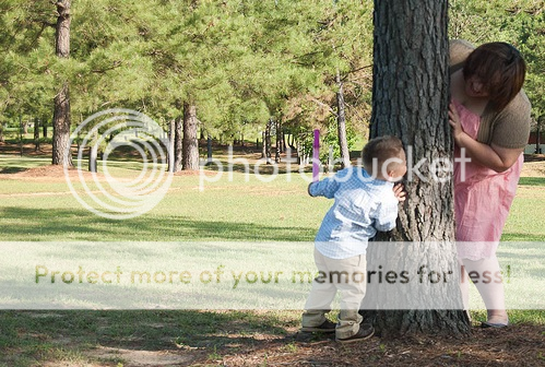
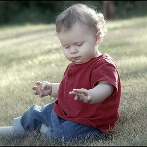
I posted yesterday, and appreciate all the responses I got. Here is another pic from that day. As stated in earlier post..I'm very much a beginner and took shots for a friend. With this pic, again the dappled lighting is present and at the time I took these had no idea what to do about that.
But what I'm asking for critique on this photo, is just in general does it work? Apart from the hot spots on his shirt, are they too underexposed? Is the little boy in focus? I am really having a hard time telling if he is or not. Composition ok?
Thanks for the feedback in advance!
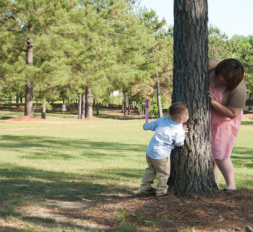

Bevan11 by mchatham79, on Flickr
 
I think the biggest concern here is perspective. We're WAY too far back to see the emotion... the interaction. And I want to!

I can practically hear the giggles. I want to see that face.

-Pete
 
Mom and child are to small in the frame.

Fill the frame with your subject, not a distant background.

Using the camera in the vertical mode, and getting closer would have provided better framing for the shot.
 
Thanks guys, I forgot to mention in the first thread that this shot was not posed, I was talking to her husband and just happened to look up and see them playing with each other. I also feel it would have been better closer...I just wanted to capture the moment. Would cropping it make it better?
 
Mom and child are to small in the frame.

Keith! Come on! Not YOU!

Fixed.

"C'mon," would have also been acceptable. :lmao:


MC, I just want to suggest that you watch how you crop. Try to stay to standard crop ratios, or even square. There is actually science behind crop ratios, and how the eye and brain see things. Your crop is not quite square and not quite rectangular. It's in that in between, ackward shape.

:)

Which would still be a rectangle ;)

Although not standard ratio
 
Mom and child are to small in the frame.

Keith! Come on! Not YOU!

Fixed.

"C'mon," would have also been acceptable. :lmao:


MC, I just want to suggest that you watch how you crop. Try to stay to standard crop ratios, or even square. There is actually science behind crop ratios, and how the eye and brain see things. Your crop is not quite square and not quite rectangular. It's in that in between, ackward shape.

:)

Gotcha!, Just another thing I have got to learn! :study:
 
Crop a bit off the top, and then enlarge the image; some have said the mother and child are "to small"; others have said they are "too small"; I would argue that they are simply not large enough, because the image file is TPF-sized. Or sized for TPF. Take your pick. If this image were to be enlarged to say, 19 inches wide, or more, the mother and child would immediately become larger, and easier to see. The left side of the frame shows the park setting, and the pine trees and grass that make up the park. That awfully-colored, pale sky in the upper right hand corner really is distracting, more so than the blown areas on the boy's shirt. So, again, crop out that awful sky, get rid of that,and at the same time, create a more pleasing horizontal image proportion, AND of course, jack the size wayyyyyyyy up,and thr image will become much more interesting to look at!
 
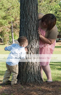
Would you suggest cropping off the top and bottom, leaving equal space above the head, and below the feet?


Needs just a tad bit more space on the right edge
2ffde242.png


4d6d1f0c.png


Derrel is right. I too prefer landscape ratio, rather than portrait.
 
Last edited:
Mom and child are to small in the frame.

Keith! Common! Not YOU!
What's the problem? Two would be wrong, as would too.

too

adv \ˈtü\
Definition of TOO

1
: besides, also <sell the house and furniture too>

2
a : to an excessive degree : excessively <too large a house for us> b : to such a degree as to be regrettable <this time he has gone too far> c : very <didn't seem too interested>

3
: so 2d <&#8220;I didn't do it.&#8221; &#8220;You did too.&#8221;>


Too - Definition and More from the Free Merriam-Webster Dictionary
 

Create an account or login to comment

You must be a member in order to leave a comment

Create account

Create an account on our community. It's easy!

Log in

Already have an account? Log in here.

Back
Top Bottom