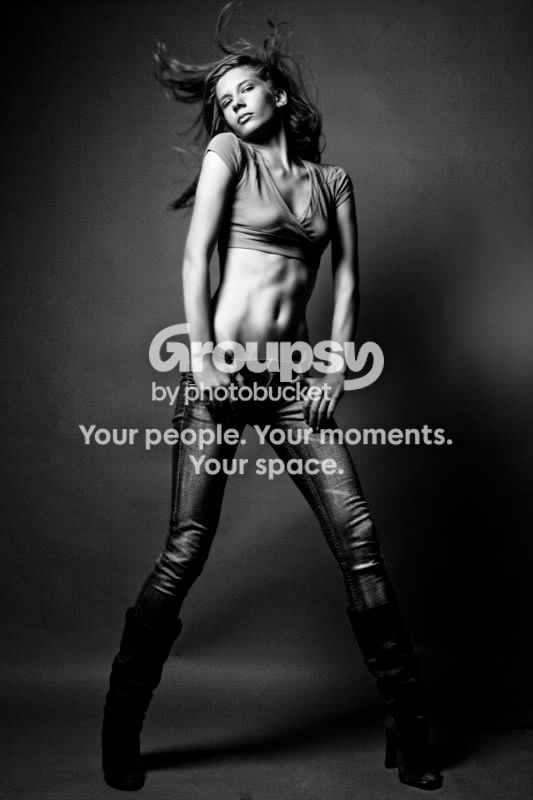
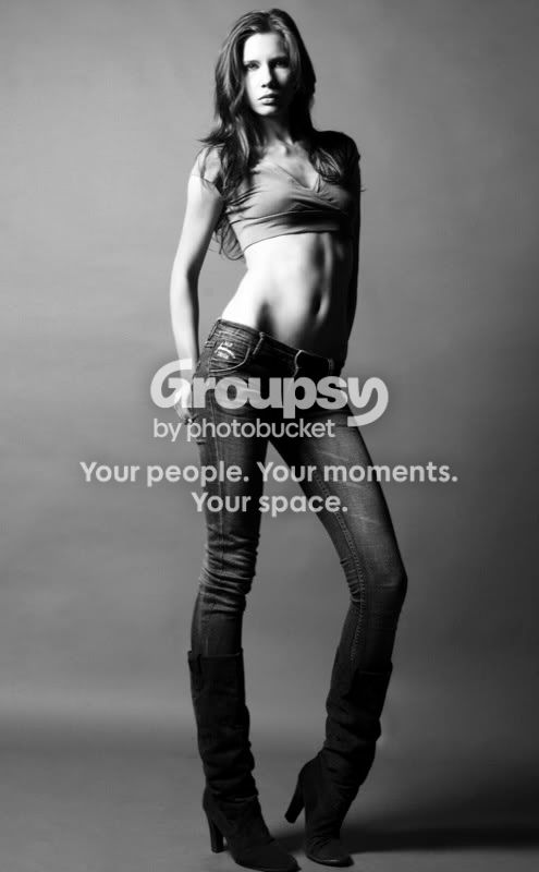
I cant decided whether or not I like the harsh lighting in #1. Also in #1 her hair isnt as sharp as I would like it. Second of all, I dont know many women outside of the street corners who would wear that top. The body position is good and not too over the top, its effective in otherwords, especially for fashion photography. And I dare say she needs some sort of "support" in the first one. And if she does have a bra on, a better one is needed.
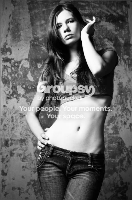
#2 We all know I like the "blown out" look, but the background distracts me.
However she kinda has the "dead eye" look. Theres nothing really connecting to the camera, which is her area she needs improvement as a model, not yours. But as the photographer, her demenor is going to take this photo from "i took this in my basement studio" to "I photographed this in a studio in NYC". I like the creases in the jeans, dont edit them out
#3 Yes, not the best of the 3. She is lifeless and shes pushing her "stomach" out which is not flattering. Well it just looks awkward. I disagree with the above that her legs look exceptionally long, its fashion photography, they are supposed to. but her head does look a tad small. However the leg position and her feet position are good. Maybe trying some a slightly higher angle or not having her leaning back as far.
I think the most important thing people need to realize about fashion photography is that the model doesn't always have to be half naked (sorry guys). Fashion photography is supposed to reflect a certain lifestyle, one that the comsumers want to live. #1 is the only one that makes me think that. The other 2 are average and anyone could do them. A good rule of thumb for fashion, especially since in #1 she looks a little "unsupported", Underwear is just as important as outerwear. And everything has to be perfect.
These are a good start. Except my minor gripes (minor comming from someone on an internet forum, but major from someone in the fashion industry) these are nice and I really do like #1




![[No title]](/data/xfmg/thumbnail/42/42492-60144191c917c21139f8acd72f6ba090.jpg?1734177011)

![[No title]](/data/xfmg/thumbnail/42/42493-2665d3a35f26795cc783aeb77329a032.jpg?1734177012)