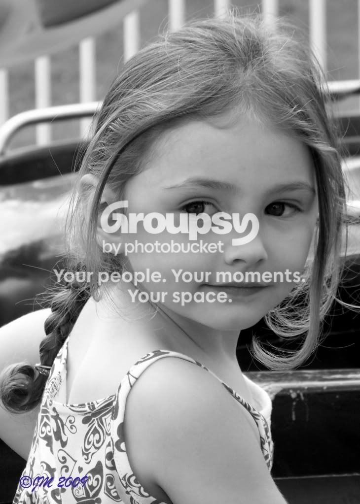
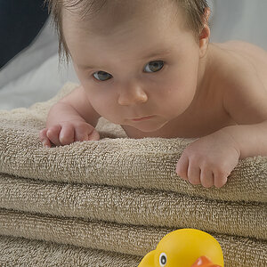
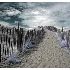
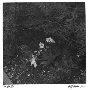
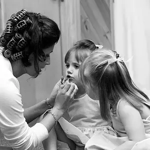
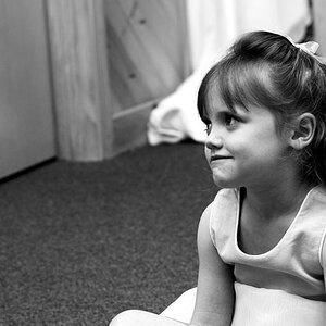
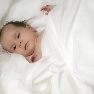
The only one that strikes me as an actual photograph is the first.
1- I like the composition and I love the choice of BW. The pose is great, and if its a candid, great moment. Need a bit more sharpness in the eyes though, they seem somewhat soft.
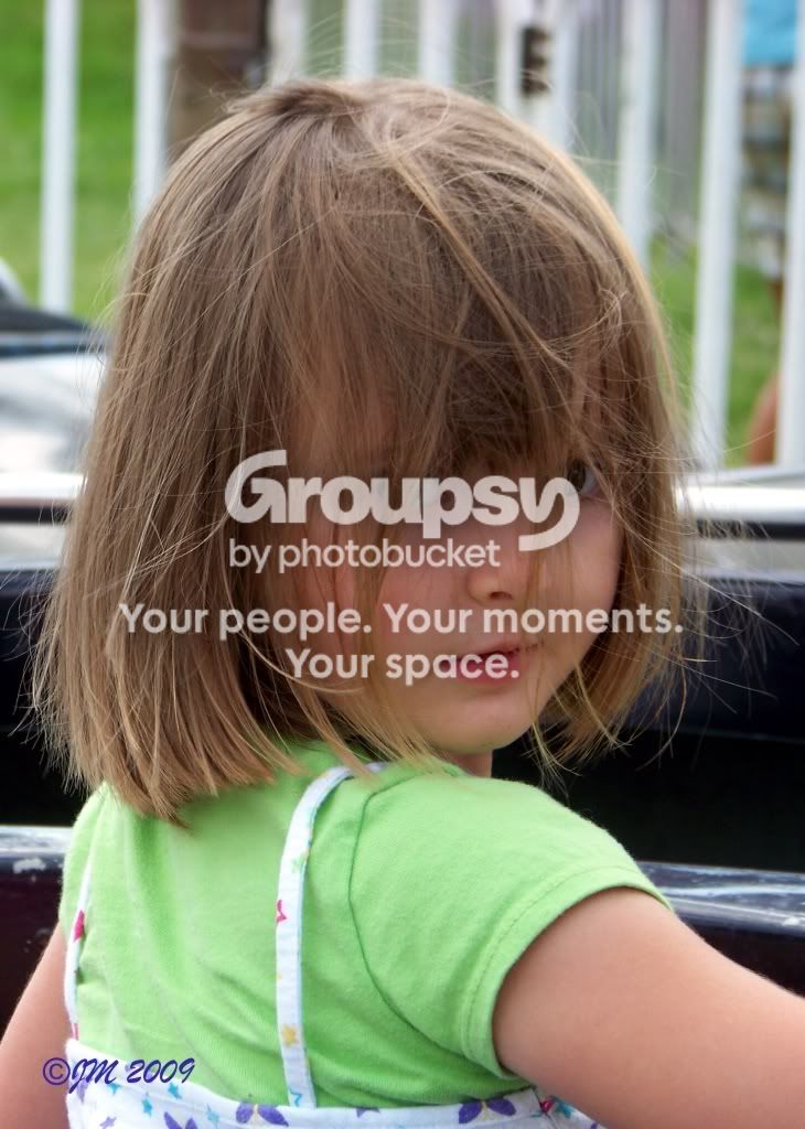
2- The hair in the face really isn't flattering. While you did somewhat blur the background, the white fence railings are distracting. You have them in the first image as well, but the girls head fills the frame more in the first image than in this one so its less apparent.
I'm not liking cutting her arms where you did.
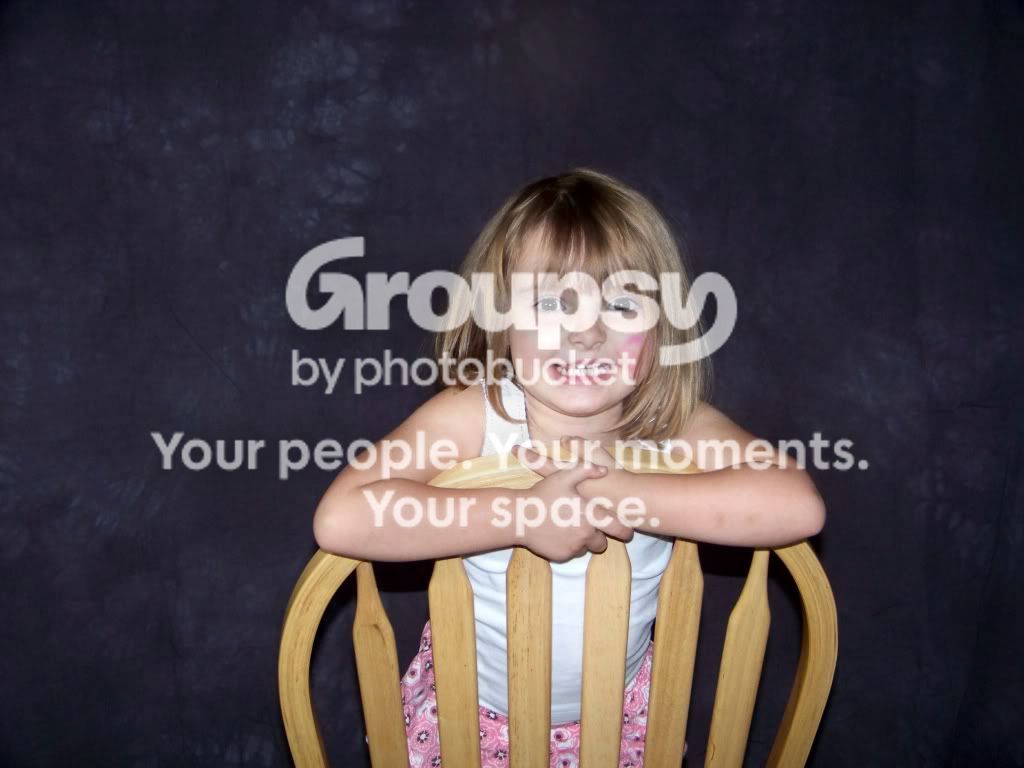
3- Did you use the popup flash here? Or a mounted flash but straight on? The light is not flattering and I find that the chair dominates more of the image than the girl. I don't like how the chair is turn backwards either, which is what probably accentuates it over the subject
The composition is drab, straight on like this, specially at a distance, is usually not flattering. It doesn't add any dimension to the image, makes the subject look flat. Have the subject turn somewhat from the camera, turn the chair around, and move in closer to fill the frame more with the child
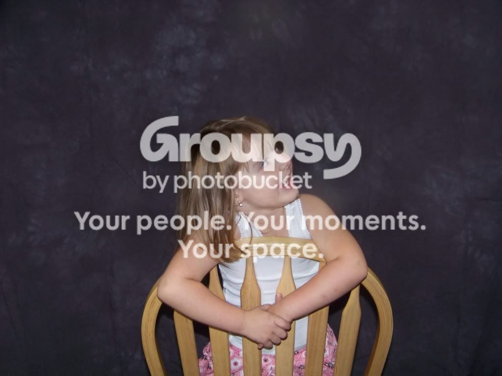
4- Same as #3, but you shot a little bit higher angle, which eliminates some of the importance that the chair had in the first (a good thing). I'm really not liking her looking straight off to the side.
google up some classic portraitures rules and try applying those as is. Once you get a handle on the basics and how they work, start experimenting with new things to develop your own style. But you need a solid foundation before breaking the rules.
I would suggest against using a popup flash. Use natural light. If you dont have any, move to a window or bring in some more house lights. If its a hotshoe flash, looking into bouncing it and using reflectors.