What's new

C&C please :)

Overall they look pretty sharp!

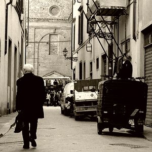
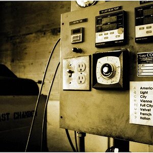
The color version of 1/2 is better than the monochrome I think. A bit wider shot would probably have been better, but that's just my opinion.

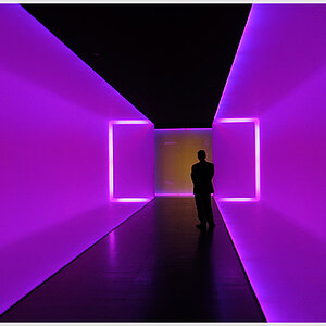
#3 is good, I like the composition, but would have been better if you had gotten lower for more of a head on look rather than looking down.

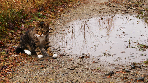
Cute kitty!
 
The cat under the leg is the better picture. maybe No1 needs the saturation pulled back a bit?
 
#1 by far the best...

the b/w doesn't work with this one... at least not the way it's processed... it's just all middle grey...
 
Thanks for the input, I like the first picture the best also. :mrgreen:
 
In the third one i find my eye being drawn to the puddle rather then the cat. Maybe if it was from a different angle like suggested earlier that would help or get in closer so the cat is bigger.
 
Yeah, I wish I could have knelt down and gotten to the cat's level more but I didn't want to risk him moving.
 

Create an account or login to comment

You must be a member in order to leave a comment

Create account

Create an account on our community. It's easy!

Log in

Already have an account? Log in here.

Back
Top Bottom